Color Map of the House: How to Use 2025 Trends in Each Room
The main thing is to remember that your home should reflect your personality, not blindly follow trends
While fashionistas update their wardrobes in mocha mousse and electric fuchsia shades, interior designers quietly revolutionize our homes. Trendy colors of 2025 have arrived in interiors, but with an important caveat: what works in clothing might fail in the bedroom. We explore which shades will make the kitchen cozier, the living room more prestigious, and the bedroom calmer. We also explain why neon fuchsia is perfect for bathrooms but disastrous in children's rooms.
- Mocha mousse works perfectly in the living room and study — it creates a feeling of expensive comfort without overloading;
- Icy blue tones are maximally revealed in the bedroom and bathroom — they soothe and visually cool;
- Earthy tones (French roast, desert sun) work best on the kitchen and dining table;
- Neon accents are only suitable in bathrooms, entryways and children's areas — they quickly tire in living rooms;
- Yellow-green tones are ideal for studies and children's areas — they stimulate brain activity;
- The 60-30-10 rule in interior design: 60% neutral background, 30% main color, 10% bright accents;
- Lighting dramatically changes the perception of trendy colors — test shades under different lighting.
Living Room: Mocha Mousse as the New Beige
The living room is the face of your home, and here mocha mousse shows itself in full glory. This warm brown shade has a unique quality: it creates a feeling of luxury even in budget versions.
Walls in mocha mousse work as the perfect background for furniture of any shade. Unlike white, which can look cold, or beige, which often seems dull, mocha mousse adds depth and character.
Designer tip: paint one accent wall in mocha mousse, leave the others cream-colored. A sofa in icy blue or deep emerald will create an elegant contrast. Add copper or brass accessories — warm-toned metals perfectly harmonize with chocolate tones.
Russian specificity: in our apartments, the living room is often combined with the kitchen. Mocha mousse works great for zoning space — you can highlight this area by color while keeping the kitchen in light tones.
Practical tip: mocha mousse absorbs light, so be sure to add additional lighting sources. Floor lamps with warm light, table lamps, picture backlighting — all of this will make the room cozy, not gloomy.
Bedroom: Icy Freshness for Deep Sleep
The bedroom is the only room where cool tones work better than warm ones. Icy blue and lavender-blue have scientifically proven soothing effects: they reduce heart rate and prepare the body for sleep.
Walls in vapor blue (dusty blue) create a feeling of cool freshness. This is especially relevant for bedrooms with south-facing windows or in homes with strong heating.
Bedroom color scheme 2025: base — icy blue, addition — cream 'cashmere milk', accents — lavender. Bedding in cream tones, lavender curtains, bedside tables in natural wood.
Psychological aspect: blue shades suppress cortisol (stress hormone) and stimulate melatonin (sleep hormone). If you have trouble falling asleep, icy blue can be a real lifesaver.
Important warning: avoid bright accents like electric fuchsia or neon flier in the bedroom. These colors activate the nervous system and hinder relaxation.
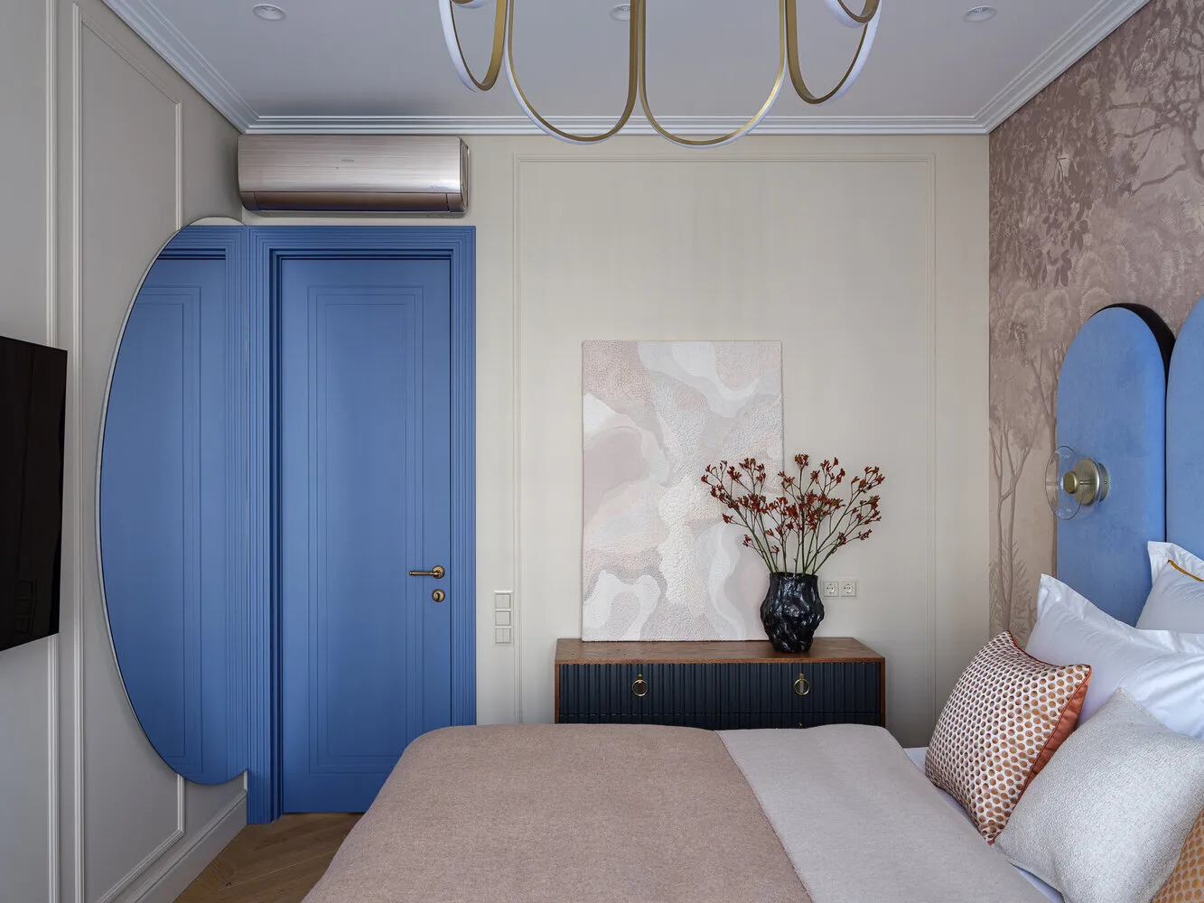
Design: Elina Musina
Kitchen and Dining Room: Earth Tones for Appetite
The kitchen is where earth tones feel at home. 'French roast', 'desert sun', terracotta — all these colors are associated with food, warmth and family comfort.
Kitchen cabinets in 'French roast' color are a return to classicism with a modern twist. Unlike the popular veneer in the past, this brown shade is warmer and less formal.
Walls in 'desert sun' create a feeling of eternal sunset — perfect for the kitchen where families gather in the evenings. This color stimulates appetite and invites long conversations at the table.
Color formula for kitchen: 60% — cream or light beige (walls, ceiling), 30% — earth tone (cabinets or accent wall), 10% — metallic accents (copper, brass, bronze).
Practical tips: dark cabinets require perfect order — every drop and fingerprint is visible. However, they hide small scratches and wear better than light ones.
Study: Yellow-Green Stimulants for Productivity
A home office or work area requires colors that stimulate brain activity. Yellow-green tones — lemon grass, amber mist — perfectly fulfill this task.
Lemon grass is a natural energy booster. Studies show that yellow-green tones improve concentration, stimulate creative thinking and reduce eye strain when working on a computer.
Designer solution: accent wall behind the desk in amber mist, other walls — neutral. Furniture — in natural wood or white color. Add live plants to amplify the natural energy of the yellow-green palette.
Alternative option: if the study is combined with the living room, use lemon grass in accessories — pillows, paintings, table lamps. That's enough to create a work mood without turning the entire room into an office.
Bathroom: Territory of Bold Experiments
The bathroom is the only place in the house where you can boldly experiment with bright trendy colors. Electric fuchsia, neon flier, cardinal red — here they don't tire but energize and recharge.
Electric fuchsia in the bathroom works as a powerful antidepressant. In the morning, this color energizes better than coffee, in the evening — helps wash away the day's fatigue. Paint one wall in this color or use fuchsia tiles.
A calmer option — lavender-blue with white. This combination creates a spa salon feeling, inviting relaxation. Add copper fixtures and accessories to complete the look.
Practical point: lighting is especially important in the bathroom. Bright colors require good light, otherwise they may look dirty. Install lights with different scenarios — bright for morning routines, dimmed for evening relaxation.
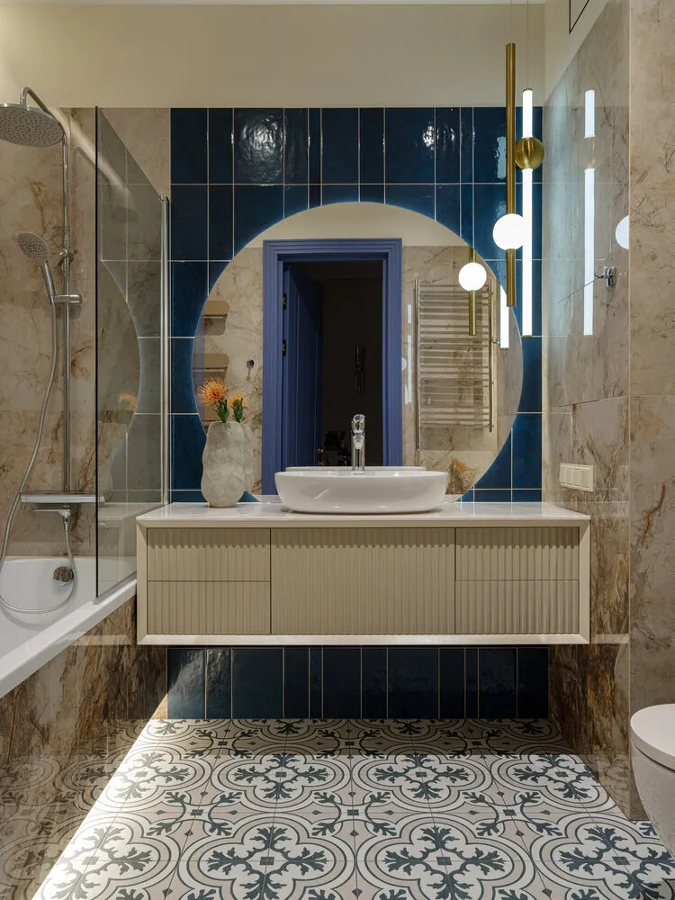
Design: Elina Musina
Child's Room: Balance of Stimulation and Calm
A child's room requires a special approach to trendy colors. A balance is needed between stimulating tones for play and study and calming ones for sleep.
Base scheme: walls in neutral cream, one accent wall in lemon grass (stimulates learning), textiles and accessories in icy blue (calms). Bright accents — in toys and decor that can be easily changed as the child grows.
Avoid at all costs: neon tones on large surfaces. Electric fuchsia or neon flier can overstimulate a child's nervous system, hinder concentration and sleep.
Age-based approach: for toddlers under 3 years old, pastel versions of trendy colors are better. For school-age children, more saturated tones can be added, especially in the study area.
Watch the video:
Entryway: First Impression in Trendy Tones
The entryway is the preview of your entire home, so bold color choices are appropriate here. Mocha mousse in the entryway creates a feeling of an elegantly decorated space from the threshold.
Practical solution: lower part of walls (panels) in 'French roast' color — hides dirt, upper part — cream. This solution visually raises the ceiling and creates a sense of space.
If your entryway is small, use icy blue — it visually expands the area. Add mirrors in mocha mousse frames to complete the look.
Color pairing rules by room:
- Transitions between rooms: use one color as a connecting element throughout the house. For example, mocha mousse in different proportions — main in the living room, accent in the bedroom, additional in the kitchen.
- Accounting for lighting: trendy colors of 2025 depend greatly on lighting. Mocha mousse under cool light may look gray, icy blue under warm light — greenish.
- The Rule of Three: in each room, use no more than three colors from the trendy palette. More creates chaos, less may look boring.
- Seasonality: in summer add more cool tones (icy blue, lavender), in winter — warm ones (mocha mousse, desert sun).
Trendy colors of 2025 in interiors are not just a tribute to fashion, but a tool for creating the right atmosphere in each room. The main thing is to remember that your home should reflect your personality, not blindly follow trends. Use fashionable shades as a foundation, adding personal touches and adapting to your lifestyle.
Cover: Design project by Elina Musina
Need a renovation specialist?
Find verified professionals for any repair or construction job. Post your request and get offers from local experts.
You may also like
More articles:
 Ships and Towers: Most Unusual Houses of the 70s-80s
 10 Trendy Finds That Will Inspire Coziness and Order
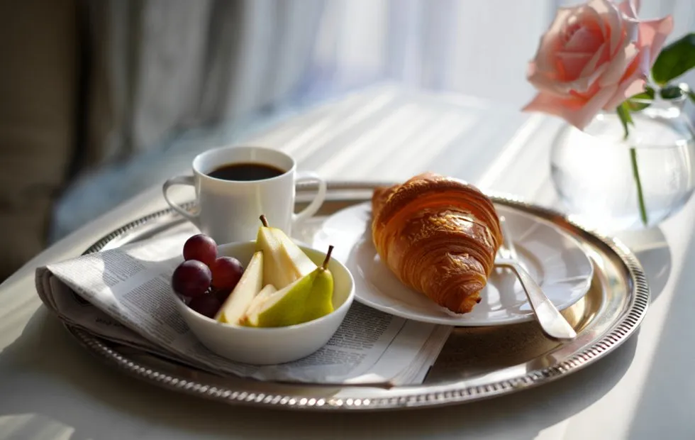 Chanel's Morning Ritual: Breakfast That Kept a Fashion Icon in Shape
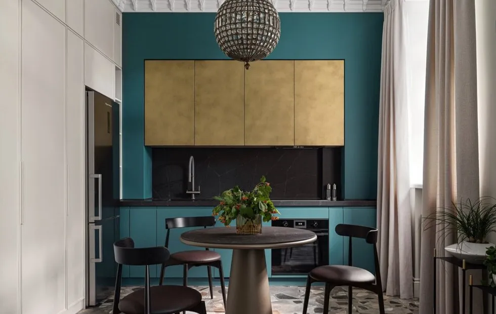 Myth or Fact: Better Soundproofing in Stalin-era Apartments
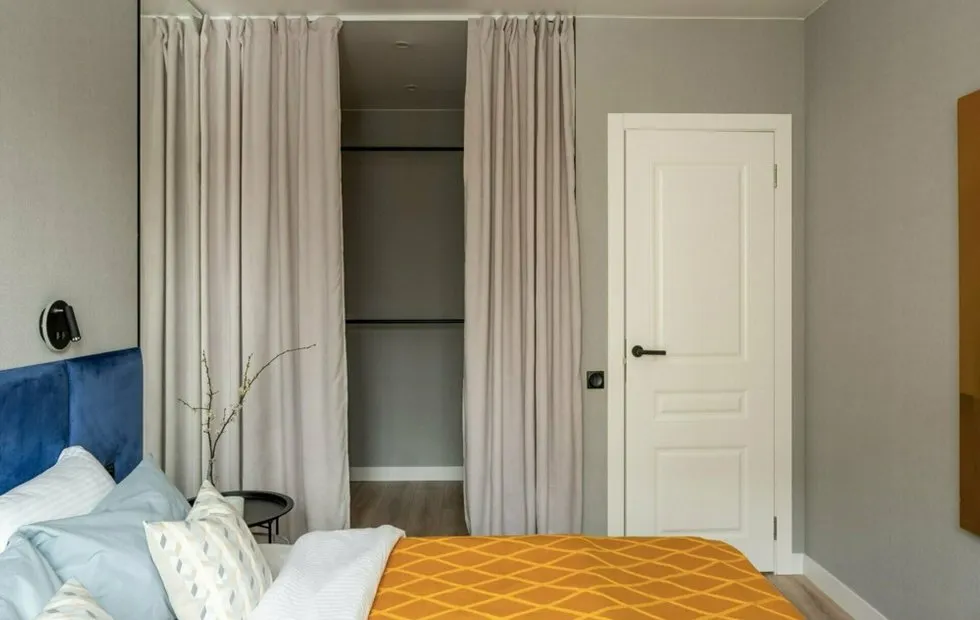 5 Genial Solutions of Khrushchev-era Layouts That Should Be Revived
 What Marilyn Monroe Ate: The Diet of America's Most Desired Woman
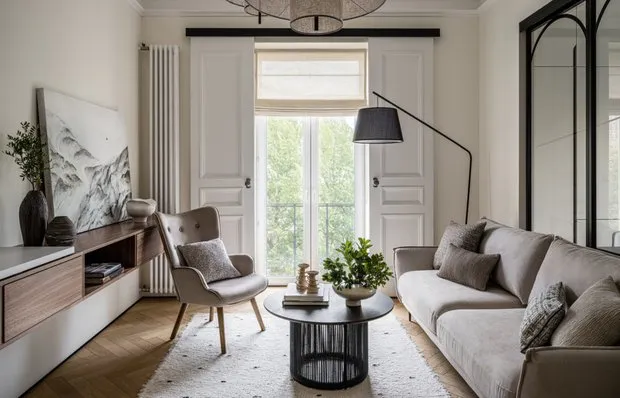 Trendy Lighting Fixtures That Will Change the Atmosphere of Your Home: 10 Finds
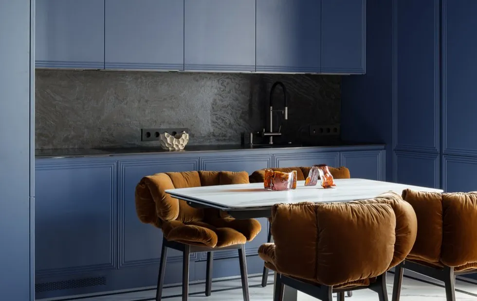 What Was Trendy in Home Renovation Five Years Ago, But Now Looks Outdated