Two-Room Apartment with Black Kitchen: Example from Stockholm
Based on this apartment, we explain how to decorate a black kitchen so it doesn't ruin the entire interior
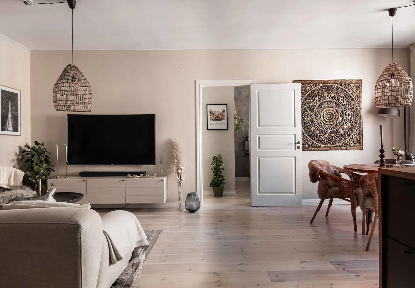
This two-room apartment with a total area of 58 square meters has a convenient layout. Despite the kitchen and living room being combined, all zones are clearly defined thanks to gypsum board partitions. The bedroom owners even found space for a walk-in closet. The children's room is located opposite the parents' room.
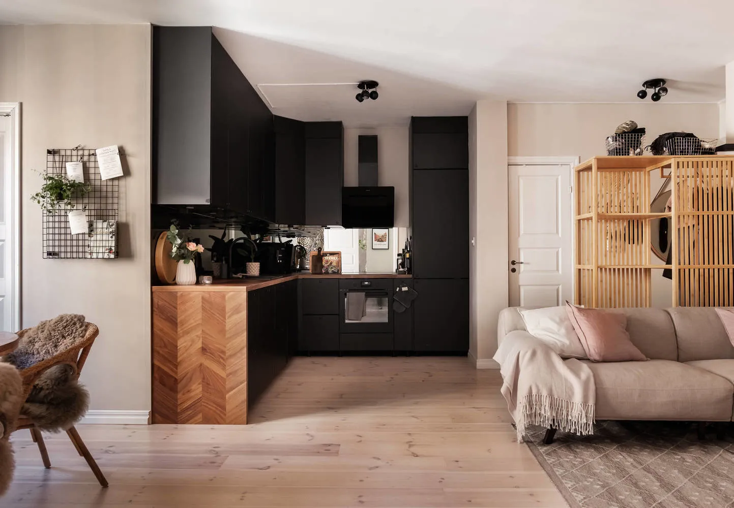
The apartment's interior breaks all stereotypes about Scandinavian style: no white walls or ascetic minimalism. What makes it worth it is just the black kitchen and bedroom walls made of textured plaster!
Despite such bold decisions, designers knew exactly what they were doing.
The kitchen with a black matte cabinet was consciously chosen, as it absorbs light in the not very sunny Stockholm.
Firstly, the kitchen has high ceilings and plenty of daylight. Secondly, despite the combined kitchen-living room, the cabinet has its own designated area due to a gypsum board wall near the refrigerator. Thanks to such proportions, the kitchen does not blend with other furniture and does not look like a black spot.
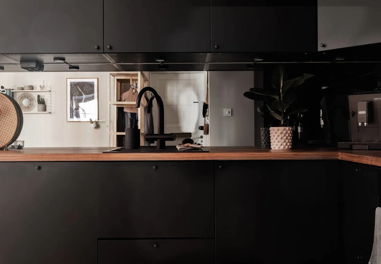
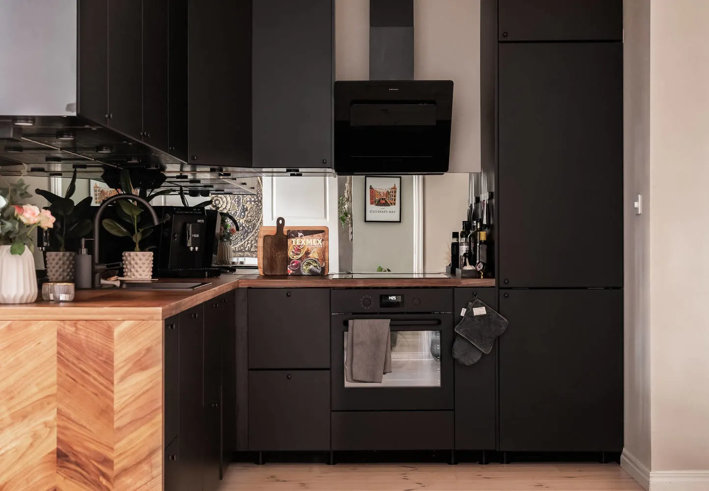
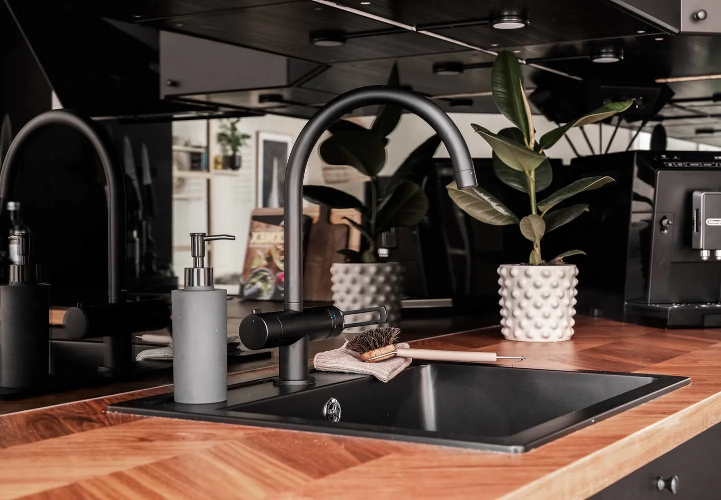
Thirdly, the best way to protect yourself and add more light is through mirror surfaces. Therefore, the kitchen backsplash was made exactly that way. It reflects both natural and artificial light — and there is now twice as much light.
Notice the task lighting — light spots — under the upper kitchen cabinets. There are many, but it is a necessity, especially in the evening. Finally, the roughness of the dark cabinet is softened by a wooden worktop, woven brown chairs, and milk-white walls.
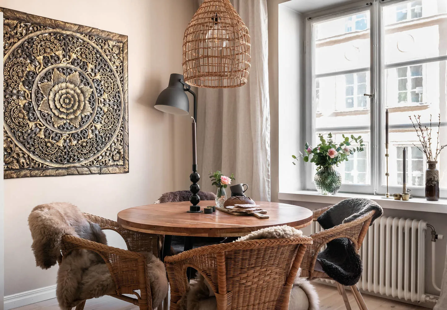
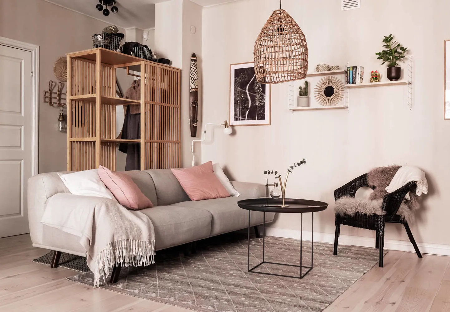
The living room has no bright accents. Instead, the designer deliberately chose a black coffee table and woven armchair to connect the entire interior.
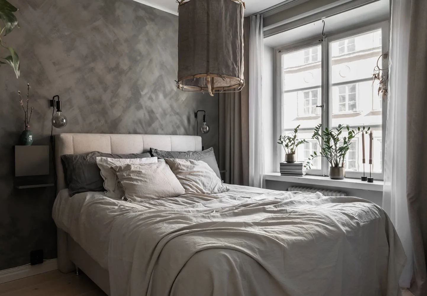
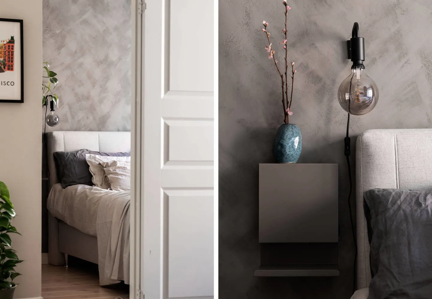
In the bedroom, there's an unconventional solution for Swedes: voluminous grey walls that visually 'consume' space. However, with a large window in the room, designers allowed themselves such an experiment.
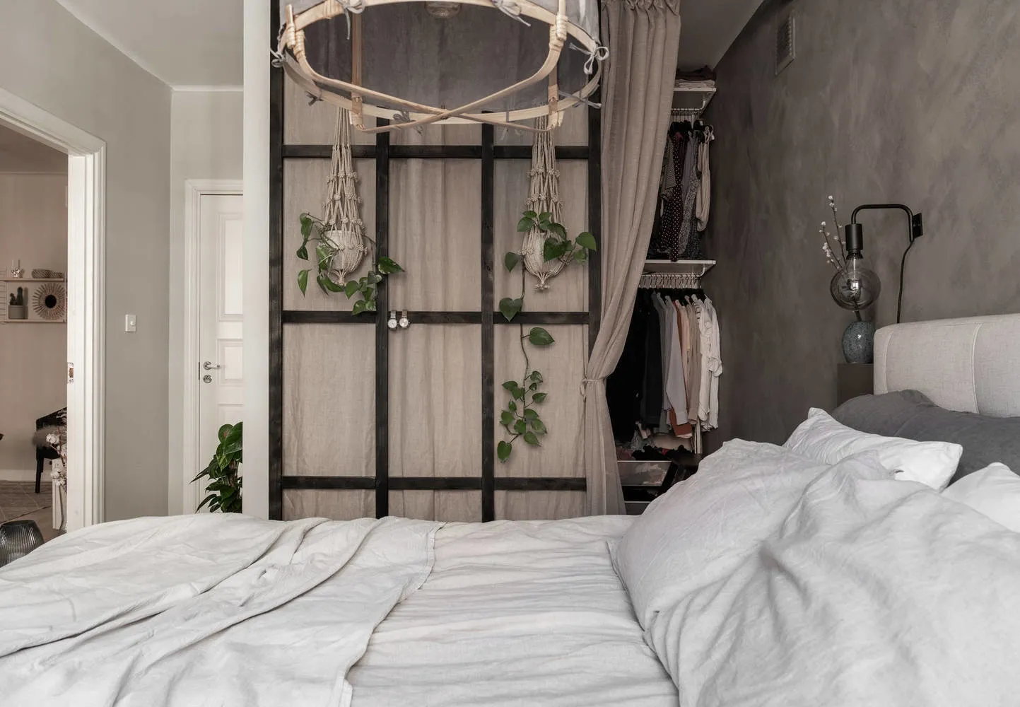
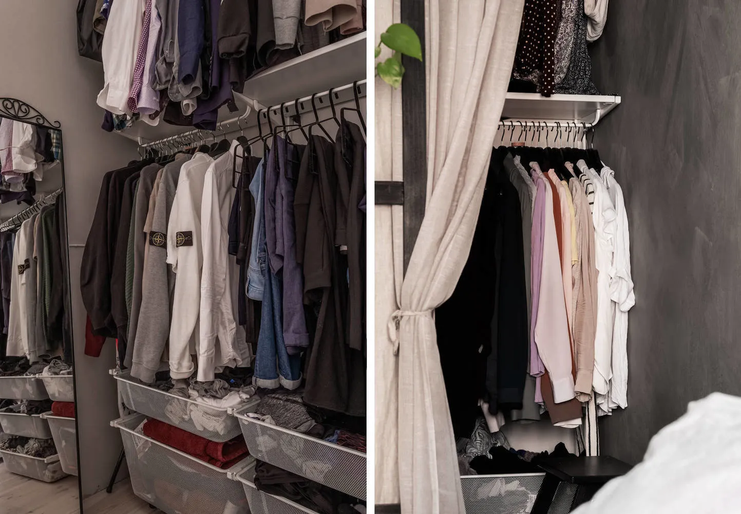
Look at how simply the walk-in closet is arranged: a black partition, a linen curtain, and two planters with flowers for brightness. To avoid cluttering the passage to the closet, narrow wall-mounted shelves were chosen instead of regular ones. Practical and convenient.
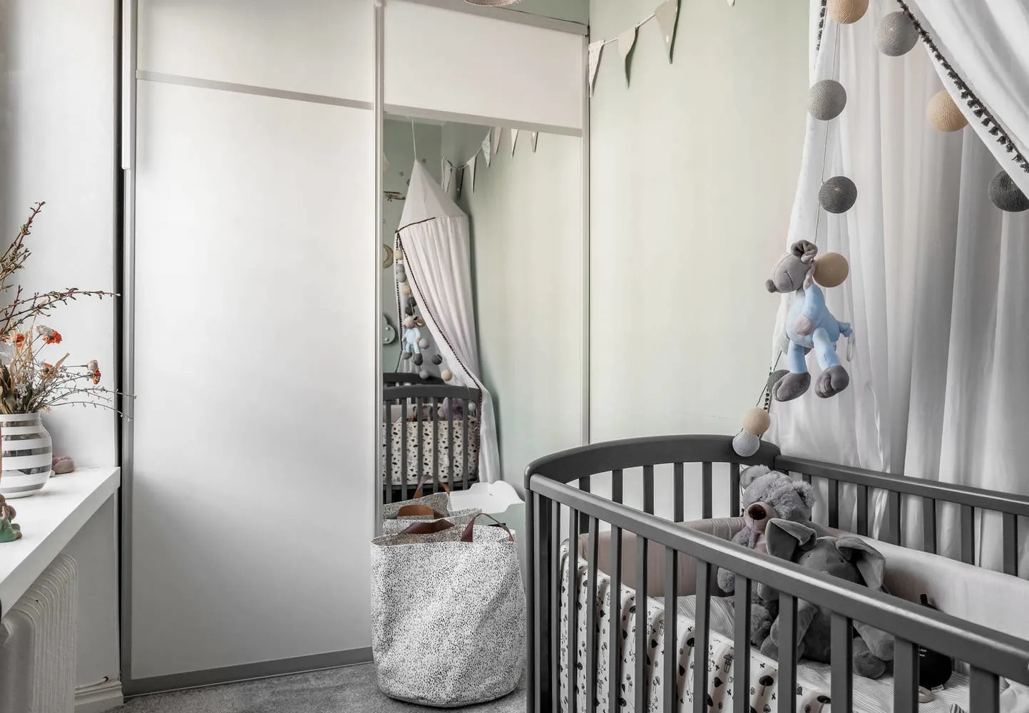
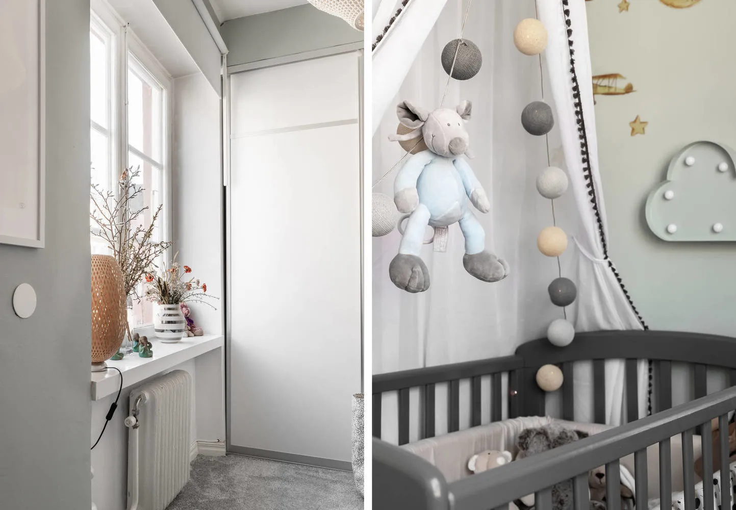
The children's room is small. To visually expand the space, designers used the same trick as on the kitchen—mirrors. So, a mirror-facade wardrobe adds at least a couple of square meters.
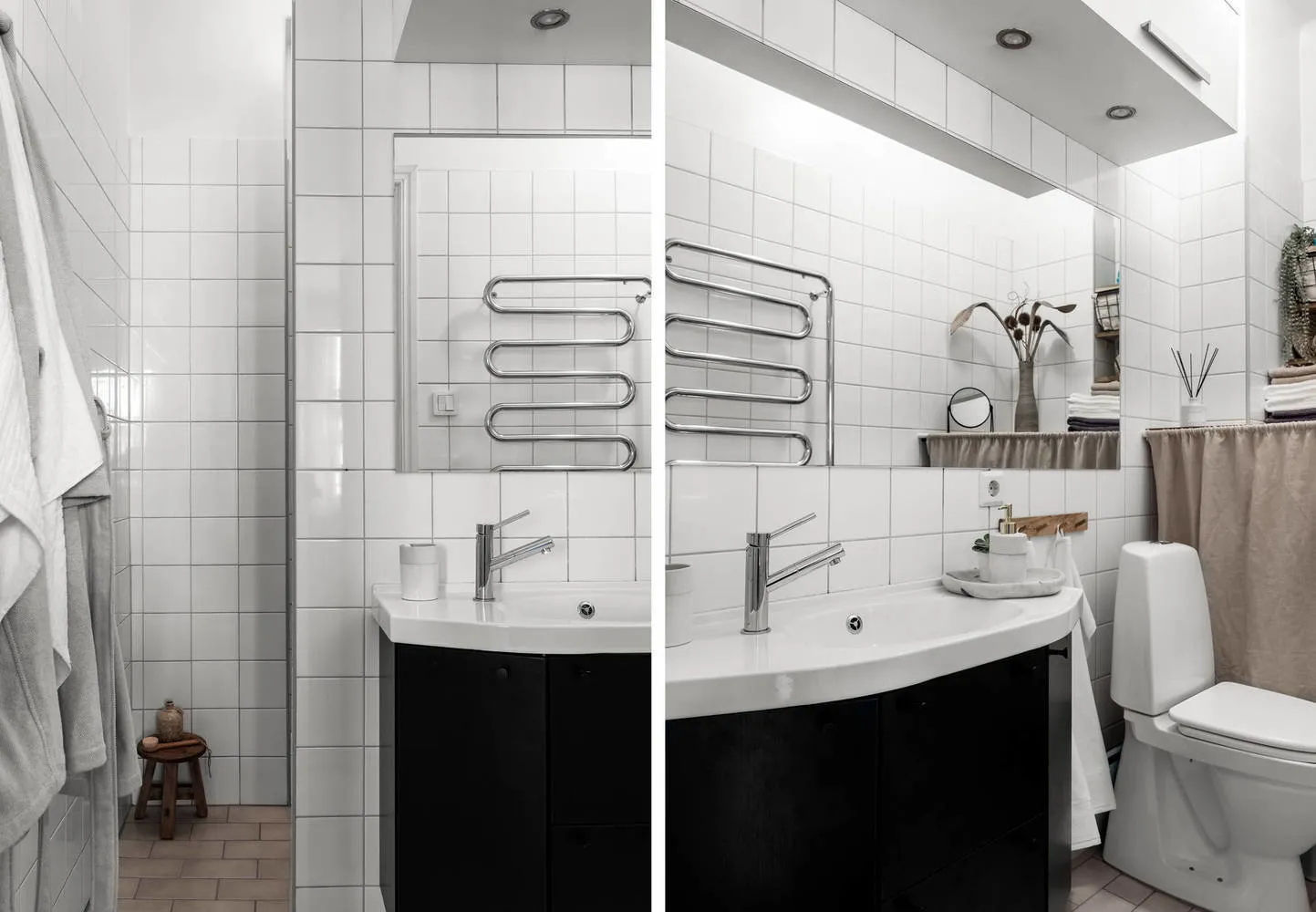
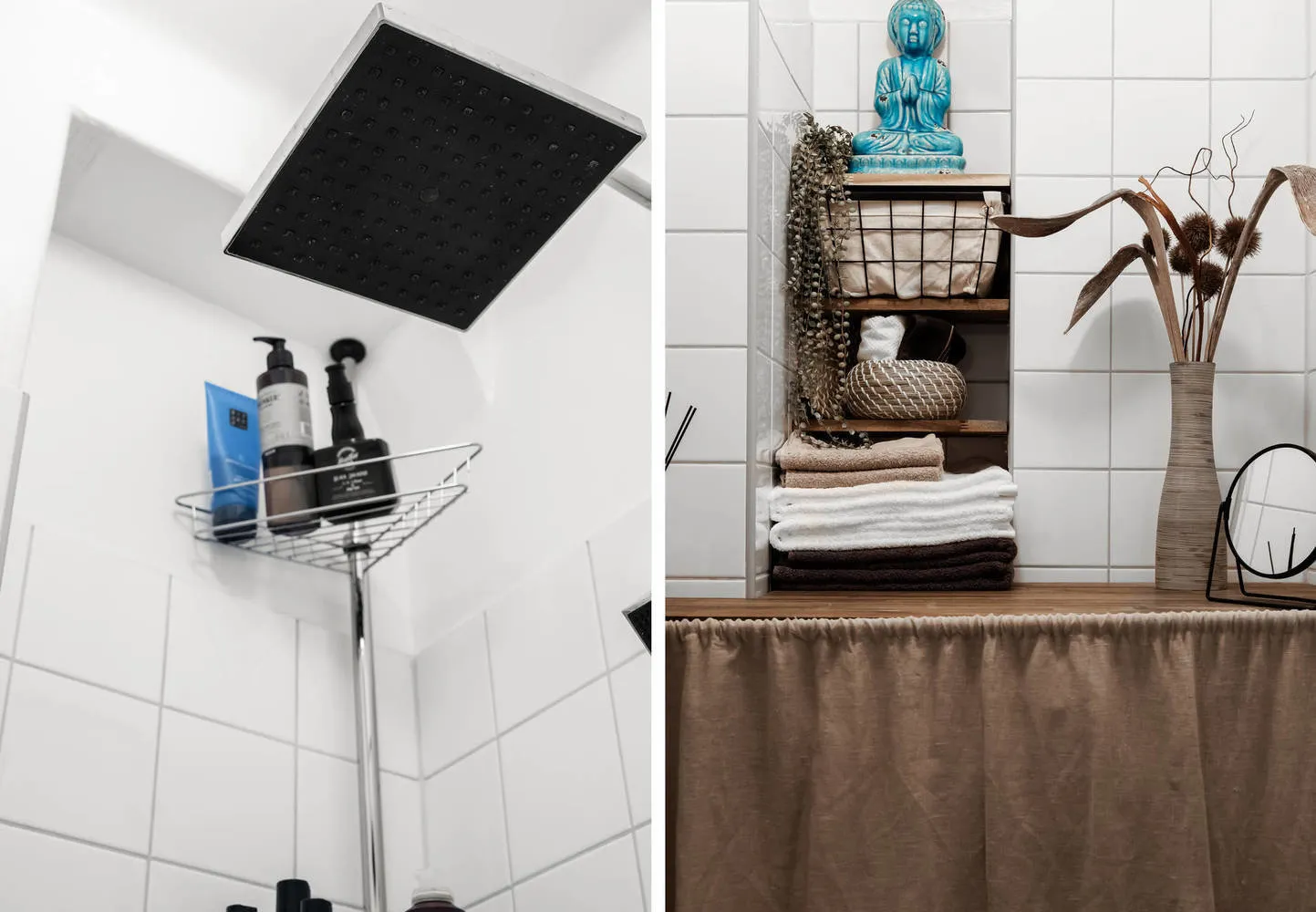
The bathroom continues the overall color palette of the apartment — black, white, and sand. By the way, to avoid overloading the space with cabinets and shelves, the storage system was simply hidden behind a linen curtain.
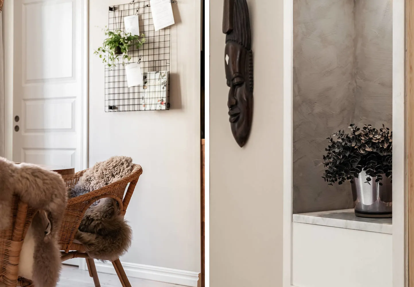
The hallway in the house is zoned with a wooden shelving unit — it serves as both a partition and a coat rack.
Layout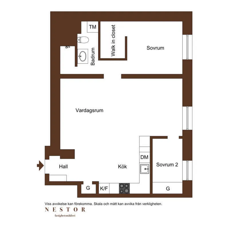
Source: Nestorfastighetsmakleri
Need a renovation specialist?
Find verified professionals for any repair or construction job. Post your request and get offers from local experts.
You may also like
More articles:
 Studio 30 sqm with vibrant finishing and unconventional solutions
 How to Incorporate IKEA Furniture into Designer Interiors?
 Kitchens in Corridors: Examples from Projects
 8 museums in the world you can visit online
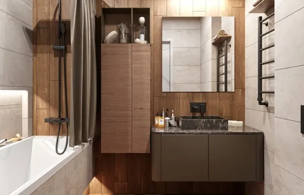 Visually Expanding Bathroom Space: 7 Tips
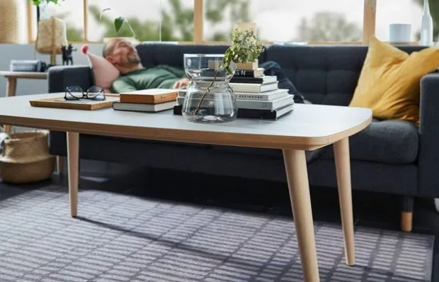 10 Cool Items from IKEA's New Collection. They Are Not Only Beautiful But Also Useful
 Personal Experience: 10 Mistakes When Furnishing a Country House
 How to Incorporate Plants into Interior Design. Great Examples in Standard Apartments