6 Apartments in Pastel Tones to Add to Your Favorites
If you're tired of bright and loud colors, choose pastel tones instead. Take inspiration from designers: these projects are full of ideas for apartments in any style.
Light Apartment for a Young Woman
The client was bored with gray interiors, so designers Diana and Alina Ibraeva decided to use calm beige tones. The monochromatic palette was complemented with green plants and decorative elements in matching colors. To add lightness to the interior, all floor trims were painted white.
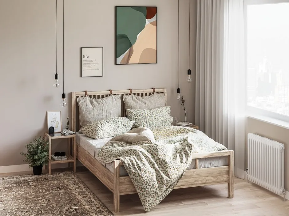
Design: ADI Interiors Group
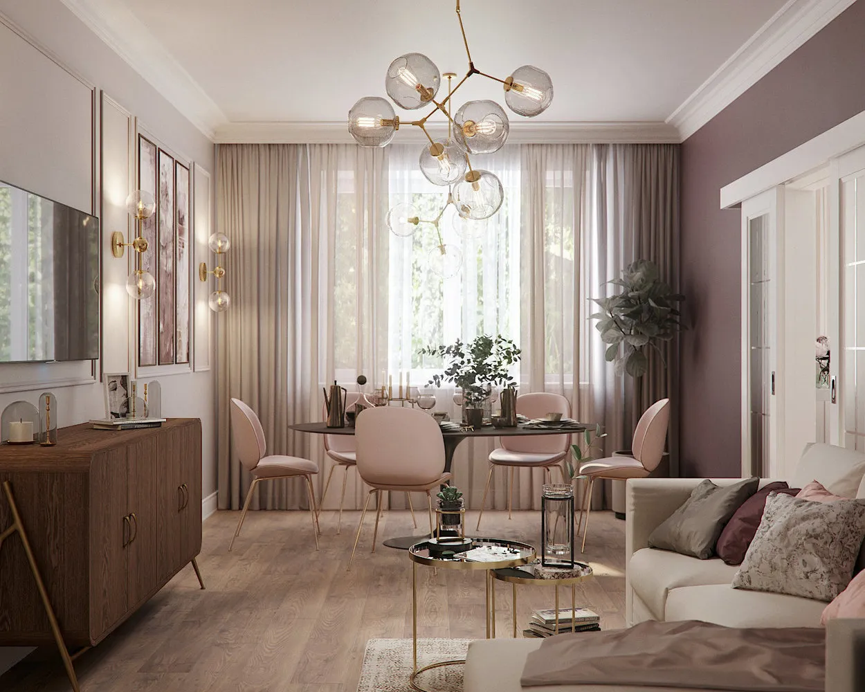
Apartment with Mint Living Room and Dining Room
The team at Cartelle Design decided to decorate each room in the apartment in its own shade. In the kitchen-dining room, mint was used: to avoid overloading the space with color, it was diluted with white and beige tones. The bedroom was decorated in a gray-beige palette, while the hallway walls were painted soft pink.
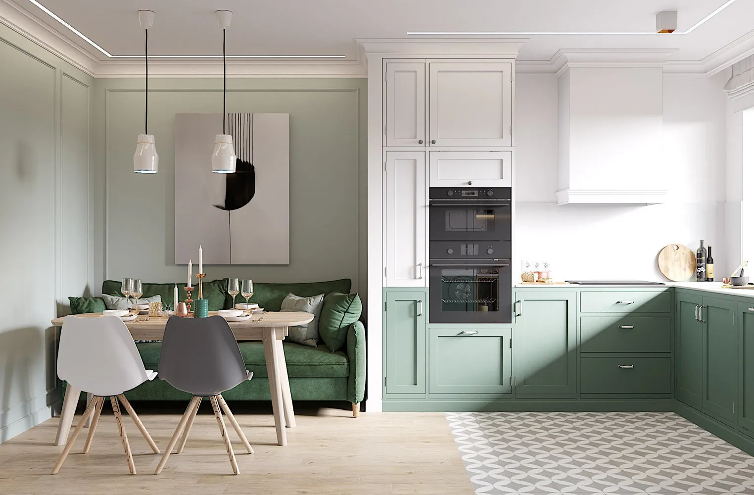
Design: Cartelle Design Studio
Boring Apartment for Rent
An apartment for rent doesn’t have to be neutral, according to designer Svetа Khabeeva, who chose almost all the colors of the rainbow for decoration. The kitchen turned out soft salmon pink, the living room—mint green, and the bedroom—dusty rose with yellow accents. The shades were chosen soft, so an abundance of color doesn’t feel overwhelming but instead attracts attention.
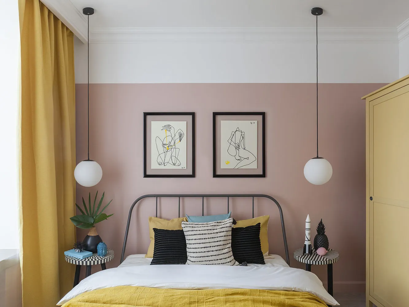
Design: Svetа Khabeeva
Interior in Gray-Pink Tones
Pink has become a common color, but designers continue to use it in their projects. Designer Elena Ivanova added dusty pink accents in the bedroom and kitchen interiors. In the living room, they played on contrast by painting the walls a muted emerald tone.
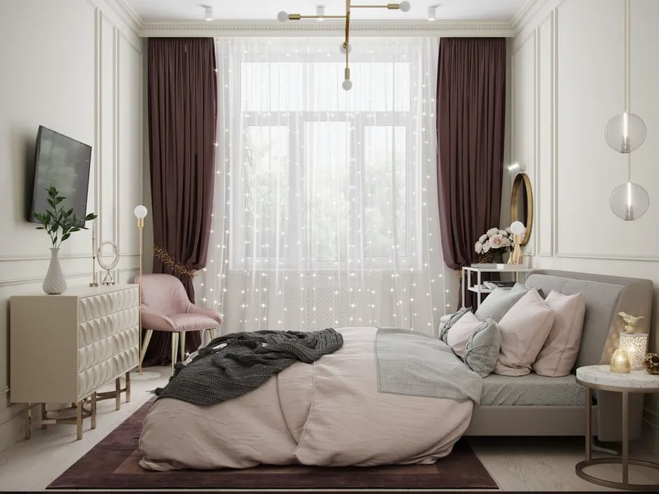
Design: Elena Ivanova
Cozy Boho for a Family with Kids
For each zone in the apartment, designer Anastasia Kudryashova chose her own shade. The kitchen and living room feature pink and lilac tones, with one wall painted in a contrasting violet tone. The bedroom was decorated in beige tones with mint accents—a safe combination for any interior style.
Design: Anastasia Kudryashova
Minimalist Apartment in Gray Tones
For her own home, designer Julia Fambulova chose her favorite color—gray. She complemented it with yellow, turquoise, and beige shades, making the interior interesting. In the children's room, the walls were painted white, and the popular gray and pink combination was maintained.
Design: Julia Fambulova
Need a renovation specialist?
Find verified professionals for any repair or construction job. Post your request and get offers from local experts.
You may also like
More articles:
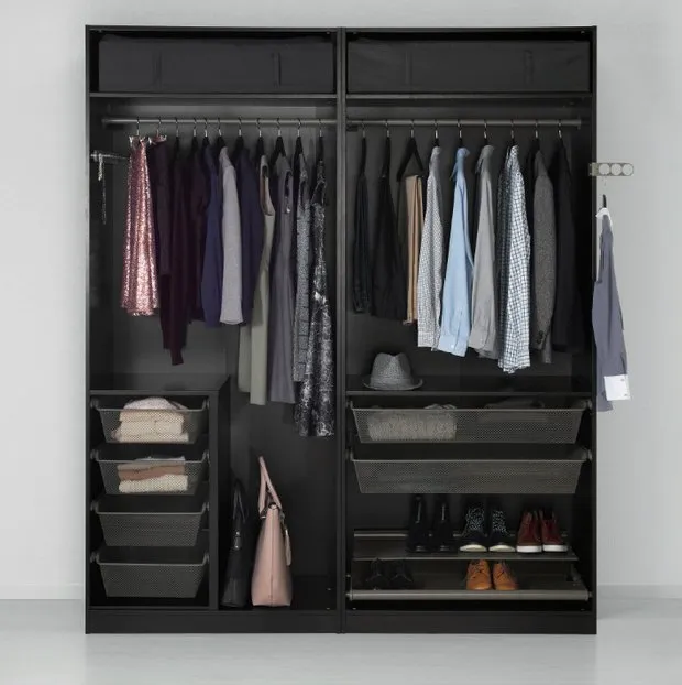 Summer Sale at IKEA: Up to 70% Off on PAX Wardrobe and 9 Other Items
 Repair Bathroom Without Mistakes: 12 Pro Tips
 IKEA Launches a Contest for a Trip to Sweden. Why and How to Participate?
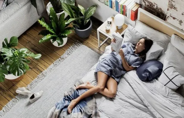 6 Ways to Survive the Heat Without Air Conditioning
 Apartments with Eiffel Tower View
 6 Ways to Zone Space Using Partitions
 How They Transformed a 200-Year-Old Cottage
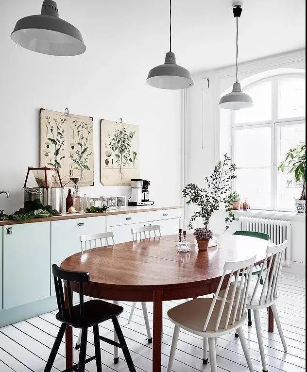 7 Useful Tips for a Healthy Indoor Climate