5 Ready-Made Color Solutions for Bathroom
Color is in trend, and it seems like this is here to stay
Warm tones can soften even a cold bathroom. Together with designer Gesa Hansen, we present 5 inspiring color solutions based on Villeroy & Boch bathroom fixtures.
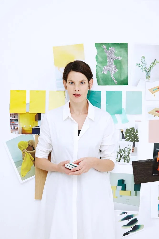
What do we know about Gesa Hansen?
ProfessiondesignerCreates handcrafted furniture under the brand The Hansen Family and has her own studio in Paris.
Awardsinternational design awardsAmong them are Red Dot Design Award and International Good Design Award of the Chicago Athenaeum.
Customerswell-known European brandsSuch as Sid Lee, Dom Pérignon, Le Mont Saint Michel, Armani and others.
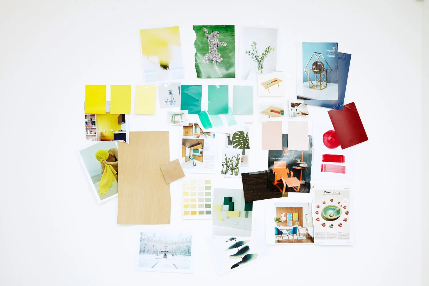
About Gesa's Concept
Gesa Hansen was inspired by Paris when creating the color concept. Each solution is a palette of colors representing one of the seasons in this city.
The concept was specially developed for Villeroy & Boch bathroom products — Artis washbasins and several models of freestanding baths made from quarzite.
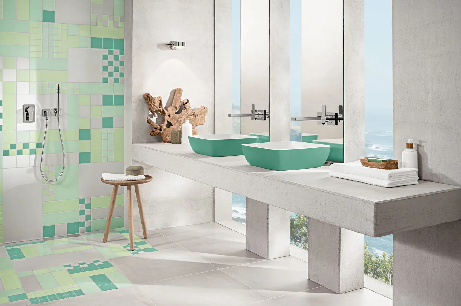
Spring Palette
Base: early green shadesmintsenchacedar
Each shade is a reference to the atmosphere of Paris. For example, a sink or bath in mint color adds freshness to the bathroom interior. It also evokes associations with the packaging of macarons from the famous pastry shop Ladurée.
How to Use? Green pairs beautifully with dark wood, gray or white elements and walls. Rough textures of flooring such as raw concrete or matte metal will emphasize the connection with lush forest greenery.
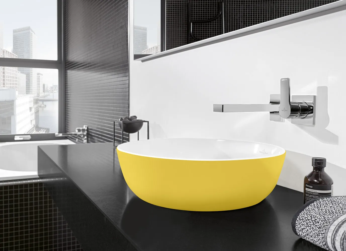
Summer Palette
Base: bright summer huesmacaronlemonmustard
According to Gesa, ceramic material appears cold and hard. Soft, warm colors can soften this effect. They remind of the midday sun in Tuileries Garden and yellow awnings typical of Ottoman buildings in the aristocratic 8th arrondissement of Paris.
How to Use? Yellow harmonizes well with light wood and works nicely in combination with pastel shades. Vibrant contrasts can be achieved by placing it next to black, while warm wood-toned browns add naturalness to the interior.
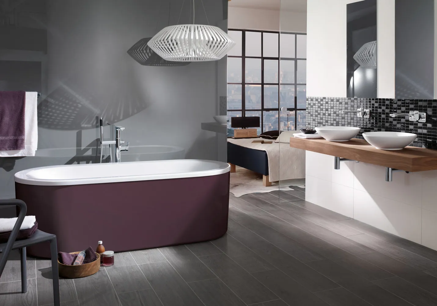
Fall Palette
Base: muted, calm shadespowderballetrose
Lyrical colors will appeal to true aesthetes and surely remind one of spending a weekend among the autumn splendor of Luxembourg Gardens.
How to Use? Pink pairs well with light surfaces and furniture, for example, made from white-gray or painted in white lacquer wood, white marble or stone dyed in cream color.
Winter Palette
Base: restrained cool tonesfogfrostocean
This color palette is a direct reference to the foggy morning in Paris and serves as a neutral, clean background for deeper accent colors.
How to Use? Blue tones create an atmosphere of freshness and cleanliness, while white or light gray furniture enhances this effect. To add warmth, you can introduce wooden accessories or yellow accents into the interior.
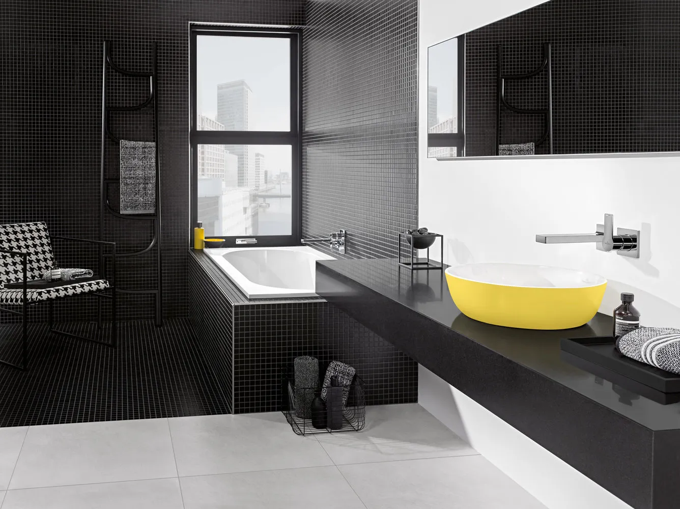
Universal Palette
Base: classic universal colorsblackanthracitelight grey
These colors can be used to create a stylish and uninteresting atmosphere, as well as complement the “seasonal” palette.
How to Use? A great combination would be placing these neutral tones next to matte gold or rich green cedar from the spring palette.

Need a renovation specialist?
Find verified professionals for any repair or construction job. Post your request and get offers from local experts.
You may also like
More articles:
 How to Plan a Kitchen Layout Yourself: Tips from Professionals
 How Much Will the Repair Cost: Making a Budget with a Professional
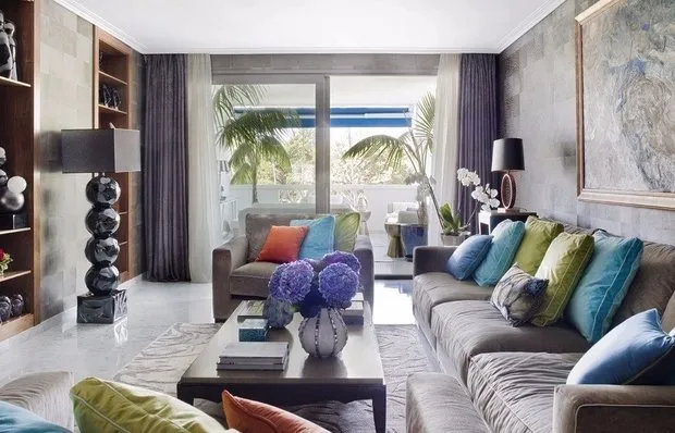 5 More Seafront Apartments You'll Love
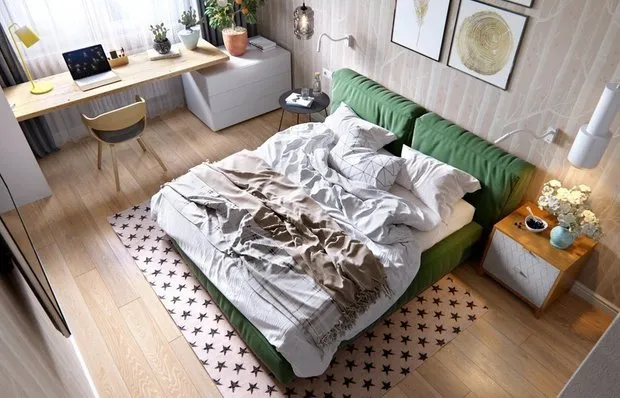 5 Fresh Ideas for Scandinavian-Style Interior Design
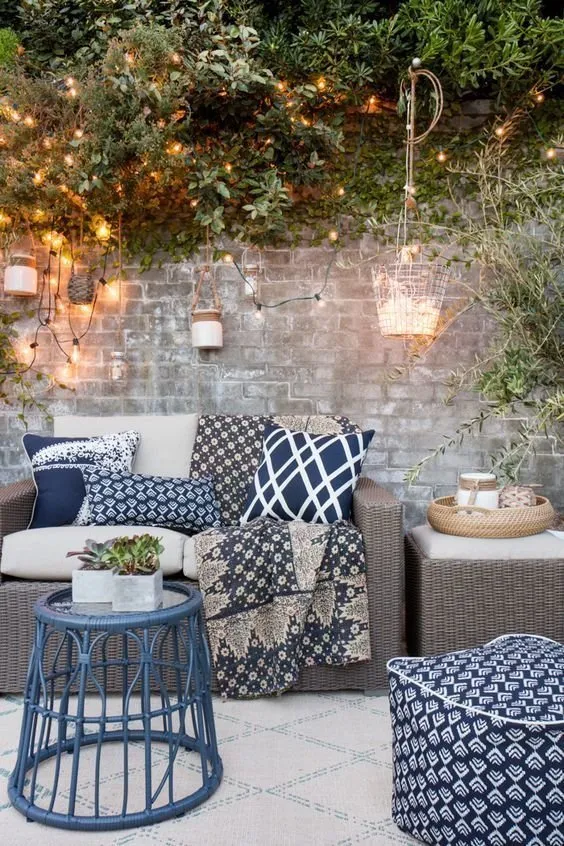 10 Fresh Ideas for Your Terrace
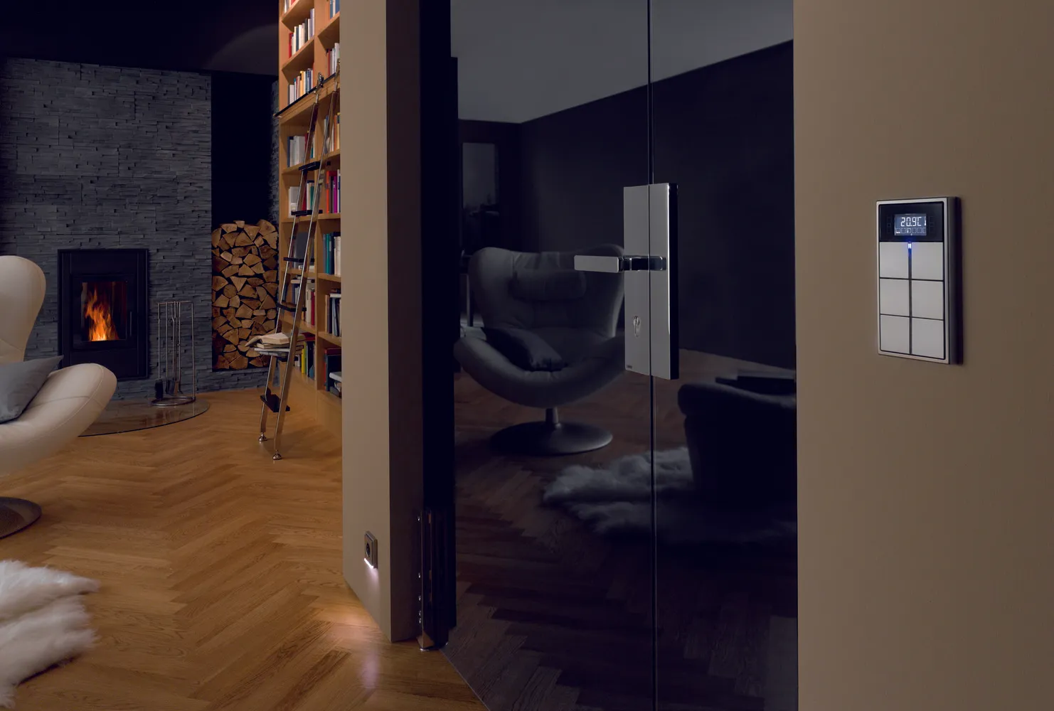 7 Reasons to Make Your Home Smart
 How to Decorate a Cozy Country House: 10 Examples
 Why You Shouldn't Be Afraid to Take a Mortgage: 8 Myths