How to Choose Colors for Interior: 10 Useful Tips
Color is the main aspect that sets the mood for the entire interior, so you should approach its selection with special attention. This task often puts people in a dilemma, but these 10 tips will help you make the right choice.
Tip #1. Pay Attention to Your Wardrobe
Your wardrobe is a great source of inspiration for choosing colors. When we prefer a certain color in clothing, we try to highlight our strengths and show our character. Subconsciously, we choose colors that improve our mood. Therefore, you can confidently transfer your favorite colors to the interior.
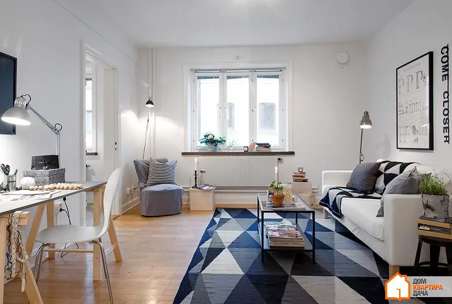
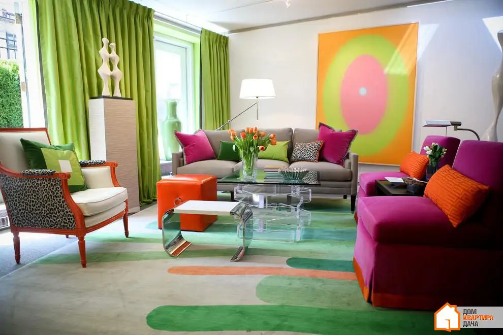
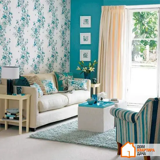
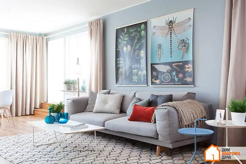
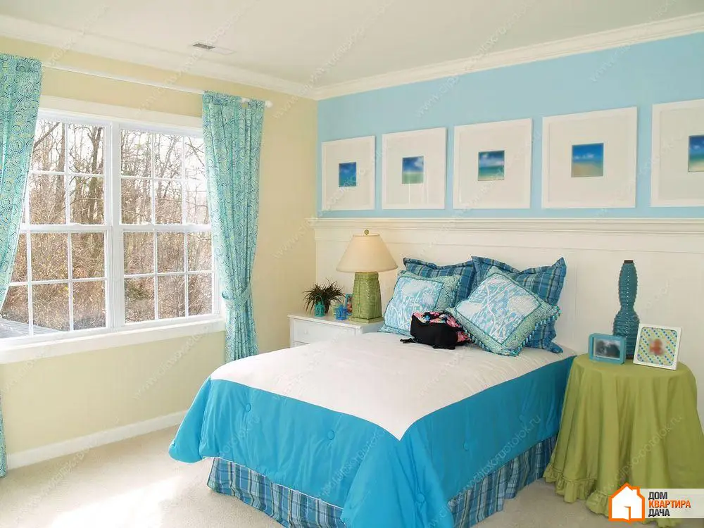
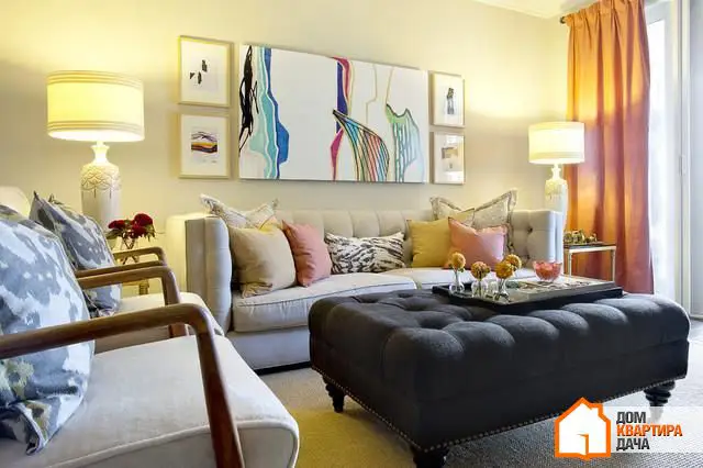
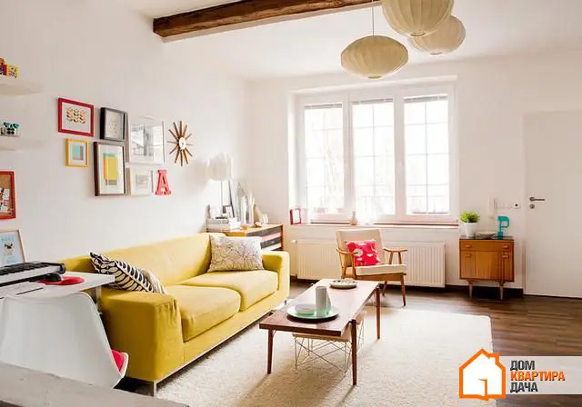
Tip #2. Use the Rule of Three Colors
Feeling lost in a vast variety of colors? Remember the golden rule of three colors: choose three shades and repeat them in different elements of decoration.

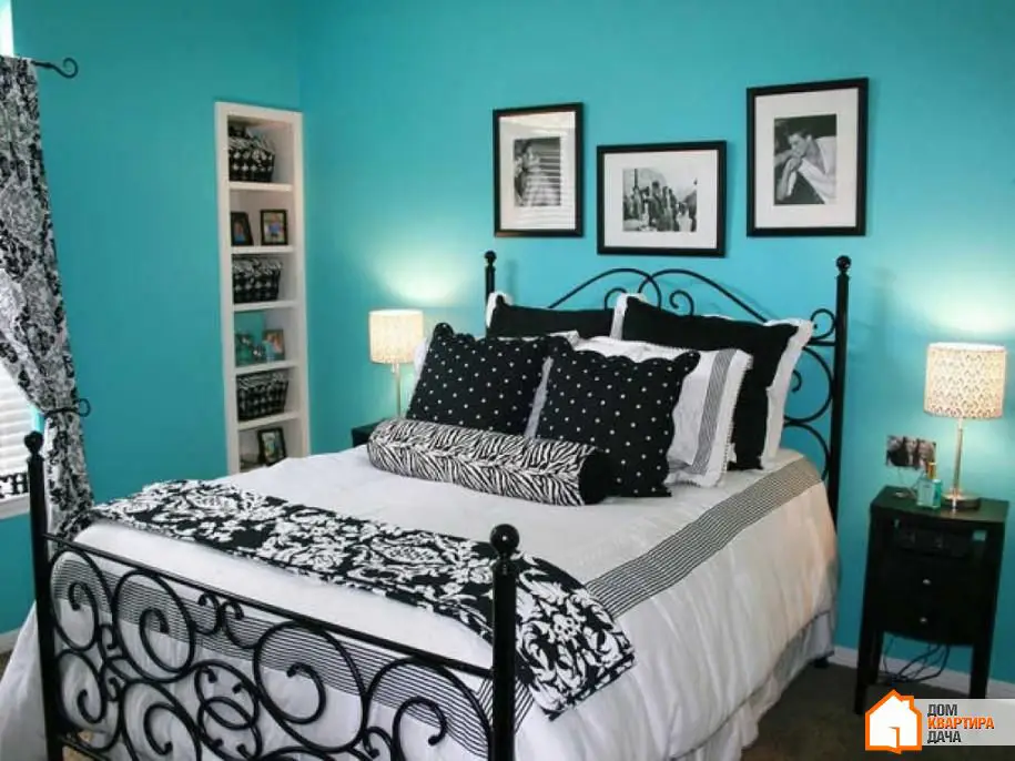
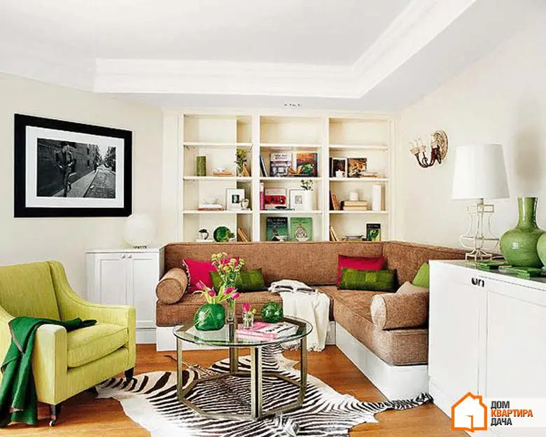
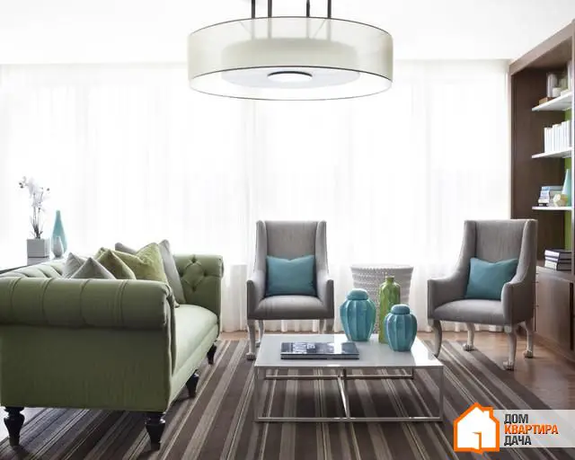
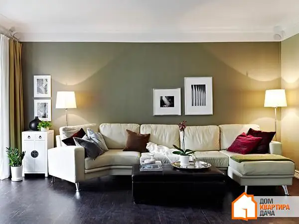
Tip #3. Remember the 60/30/10 Ratio
The color ratio in a space should correspond to the 60/30/10 formula, where 60% should be occupied by the dominant color, 30% — secondary color, and 10% is left for accent colors. Usually, the dominant color is the walls, secondary — furniture upholstery, and accent — accessories and decor items.
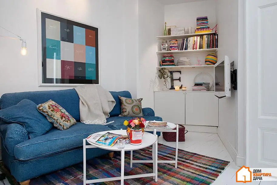
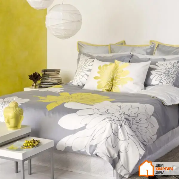
Tip #4. Add Variety with Similar Tones
An interior using only three colors can be too bland. To avoid this while not creating a color chaos, add lighter or darker shades of already used colors to your palette.
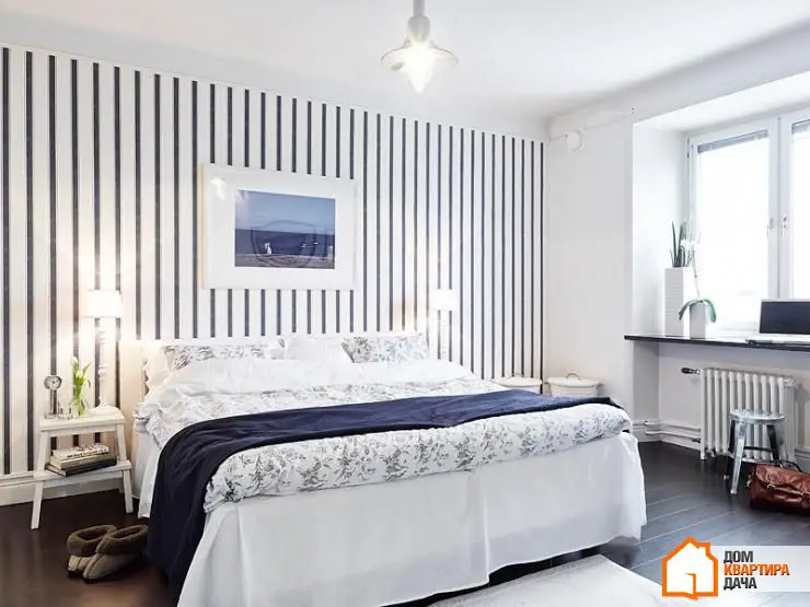
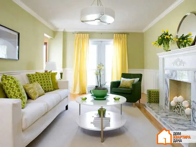
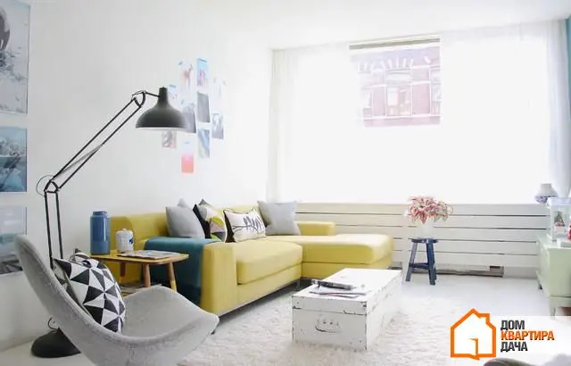
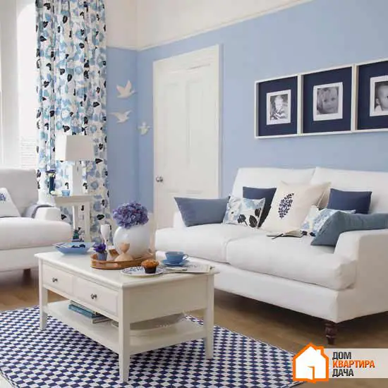
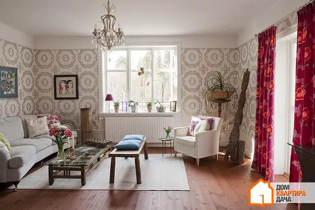
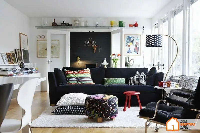
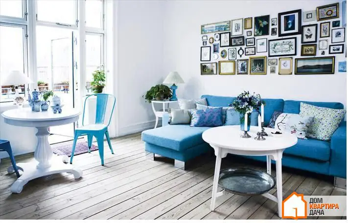
Tip #5. Maintain Balance Between Warm and Cool Tones
A harmonious interior always combines warm and cool colors. A rich warm color should be complemented by two cool light tones, and conversely, a bold and vibrant cool color should be softened with sunny warm tones.
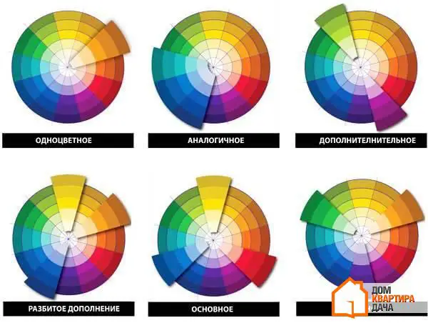
Tip #6. Use Proven Color Combinations
If you're afraid of making a mistake with color combinations, refer to the color wheel. You can be absolutely sure about several options: complementary, equidistant, analogous, and monochromatic schemes.
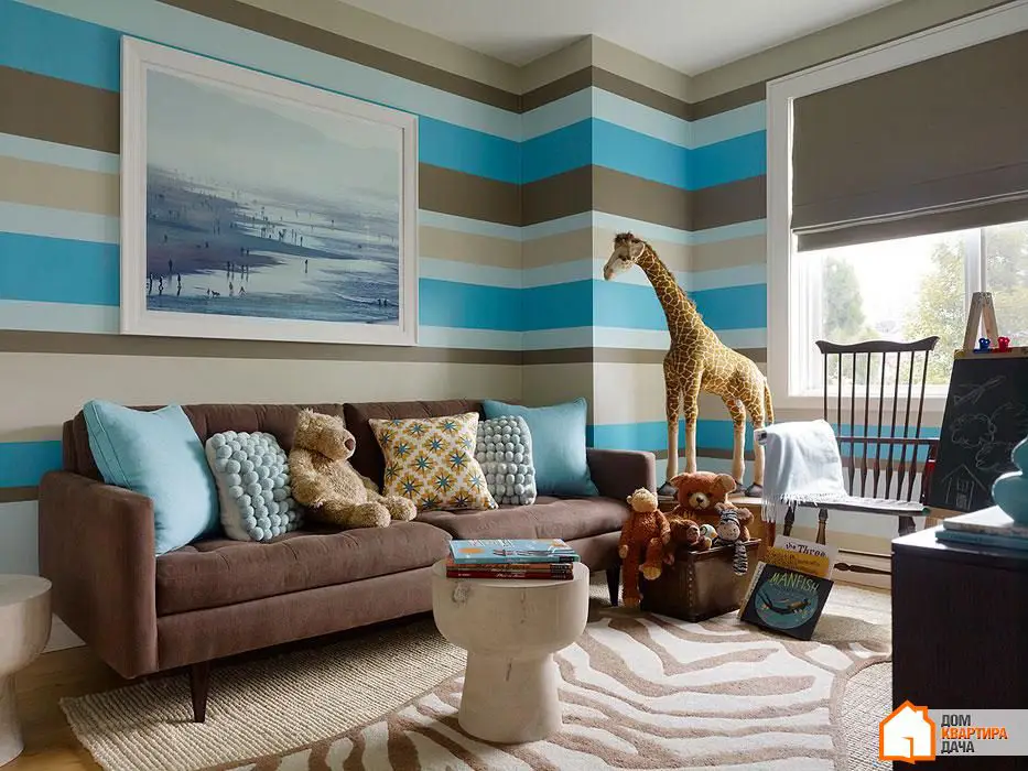
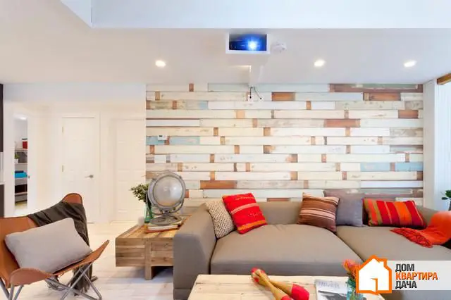
Tip #7. Remember the Weight of Different Colors
The choice of color depends on the size and layout of the room. Soft muted tones and simple patterns make the space appear more spacious and free due to their low visual weight. Therefore, they are ideal for small rooms. Conversely, more bold, bright, and saturated colors, as well as large patterns, suit spacious rooms because they add visual weight.
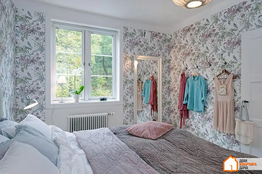
Tip #8. Don't Forget That Any Material and Texture Has Its Own Color
Wooden floors, brick walls, chrome fixtures, and gilded mirror frames — any detail in a space has its own shade that must be taken into account. Too much variety in colors can turn an interior into a true chaos, and the final drop might be such seemingly insignificant details like cabinet handle colors that don’t match other metal elements.
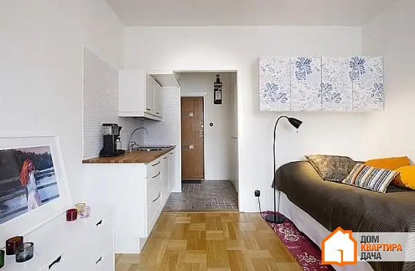
Tip #9. Remember About Harmony
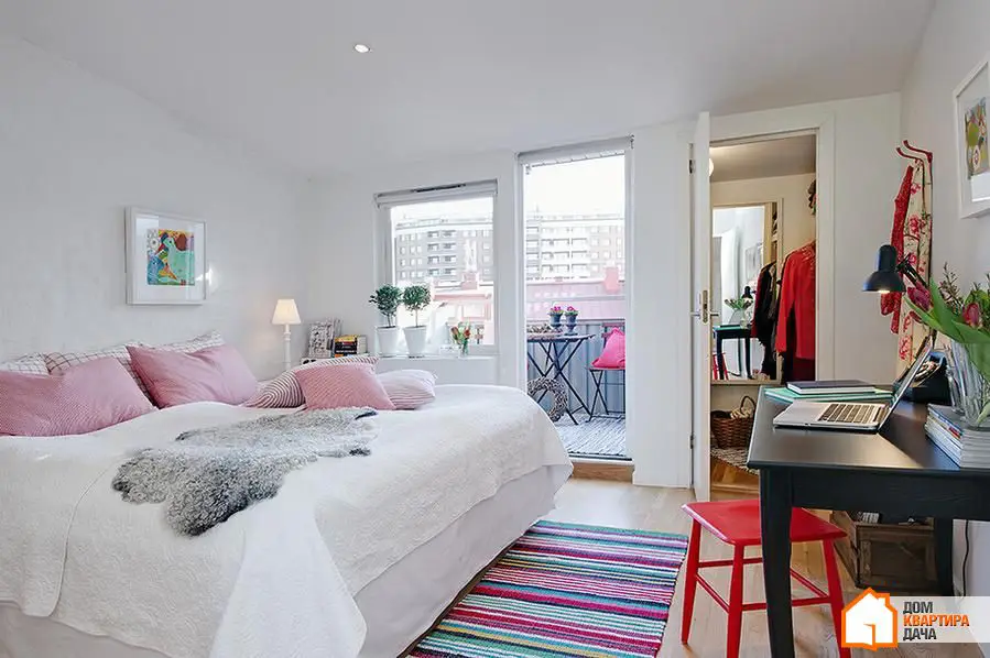
An interior becomes harmonious when darker tones are placed lower and lighter ones higher. Even in light Scandinavian interiors, floors are darker than walls, following the nature where the earth is always darker than the sky.
Tip #10. Create a Color Swatch Catalog
Collect your own catalog of color swatches when selecting paint, materials, furniture upholstery, and decor items. It's quite difficult to remember the right shade, but with swatches, you can always easily navigate in stores.

Need a renovation specialist?
Find verified professionals for any repair or construction job. Post your request and get offers from local experts.
You may also like
More articles:
 21 Hypnotizing Exterior
 35 Excellent Ideas for Your Unique Home
 20 Amazing Space-Saving Inventions for Every Room in Your Home
 20 Glass Staircase Designs with Transparent Walls Enhance Unique Home Design
 31 Best Design Ideas for Efficient Space Usage
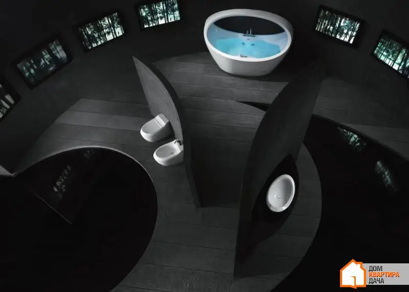 17 Most Amazing Bathrooms on Earth
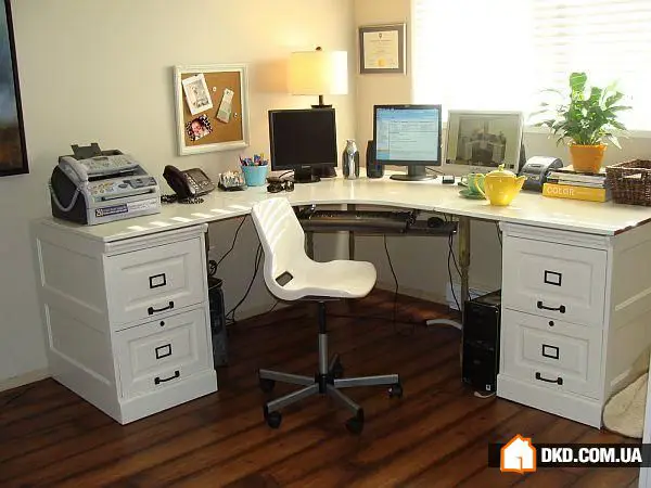 20 Variants of Office Table for Home, Which You Can Make Yourself
 13 Useful Tips for Decorating Home in Neutral Tones