Color Psychology: Science or Pseudoscience?
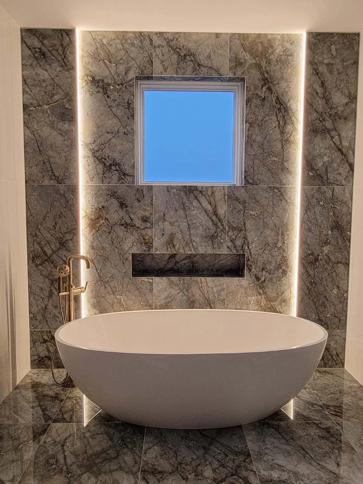 (Photo provided by Kurrent showroom Brooklyn, NY)
While few dispute that color affects mood, some take it too far
Color psychology has been trendy for decades, but given that people often follow color stereotypes, it's fair to say the 'science' of color psychology is beginning to transform into a new era of pseudoscience.
Search online for the combination psychology+color+any part of your home. What you'll find are varied expert opinions. One site with an article on this topic has the title "15 Ideal Colors for Office." Fifteen, yes? And all of them 'ideal'?
Keep searching and you'll easily find "10 Colors That Enhance" (insert desired positive emotion). With so many statements and colors, it seems the essence of how colors can influence people differently shifts from observational science (or common sense) to Jackson Pollock-style subjective projections.
Green is associated with loyalty according to one color scheme. But another version says green attracts prosperity. Are these two concepts related? - Of course, sometimes. But we've moved away from the core, especially when discussing color in interior design.
Loyalty, prosperity, clarity, success, respect... all great, but not the values most of us consider when renovating a kitchen. Color may or may not have the ability to bring you prosperity, but for most people, color simply needs to pass the Marie Kondo test: does it bring joy? How does it make you feel – good or bad?
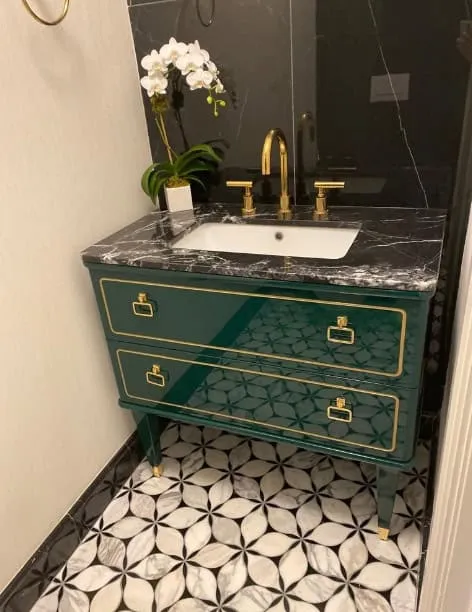 (Photo provided by Kurrent showroom Brooklyn, NY)
Take this dresser created by interior designer Kurrent from New York. There's no need to psychoanalyze the colors and style, just ask yourself: does it look 'cool'? If yes – winner.
In short, color psychology shouldn't resemble horoscopes; vague standard sets of words often overstep the mark. The link between color and psychology shouldn't become pseudoscientific, because it isn’t. Everyone in the home decor industry knows this, as do most 'average people'. Most wouldn't paint bedroom walls bright pink – not out of hatred for femininity, softness or creativity, but because it just doesn't look good.
Another stylish brand from New York, Gessi, has a showroom where almost all colors imaginable are used. Several walls of the showroom are huge screens exploding with colorful visuals reminiscent of smoke, fabric and water. Another wall in Gessi is adorned with colors, vines and butterflies – a 3D art deco blend of shades and hues that almost dares you to jump into it. But walk a bit further and look at the faucets for sinks and showers, and you'll find brushed metal with bronze-gold color (and other colors), bamboo and wood that say: "luxury".
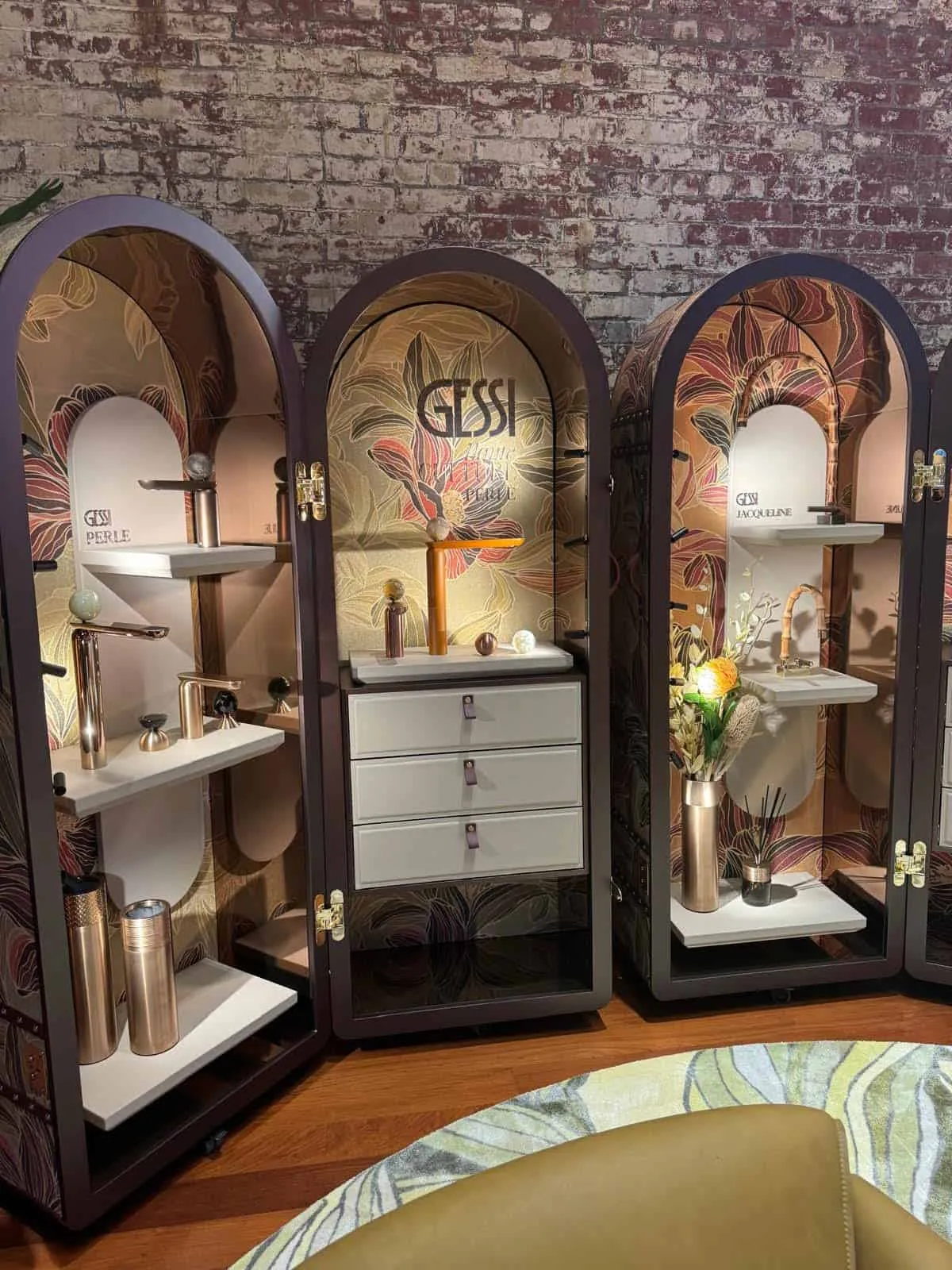 (Photo provided by Gessi Showroom)
Certain colors have been associated with parts of human experience for millennia. For example, black color. Beautiful, deep black was very difficult for ancient people to produce. Usually they had to repeatedly dye it dark blue, then add various chemicals so that the darkest blues could penetrate deeper. Due to the labor-intensive process, black color was expensive.
Ancient Romans used black for mourning and at funerals, not just because it's a 'sad' color. Wearing black was costly, so it was a sign of respect. That many cultures still use black at funerals despite the fact that black is now easy to create shows the strength of old associations.
Black = expensive continues today: luxury dresses and suits, high-end cars, numerous types of electronics and more. And this concept extends to pop culture: Darth Vader's uniform is black because being powerful costs money. (Some cultures in Asia use white as a color of mourning. But pristine white suits are also expensive and hard to maintain.)
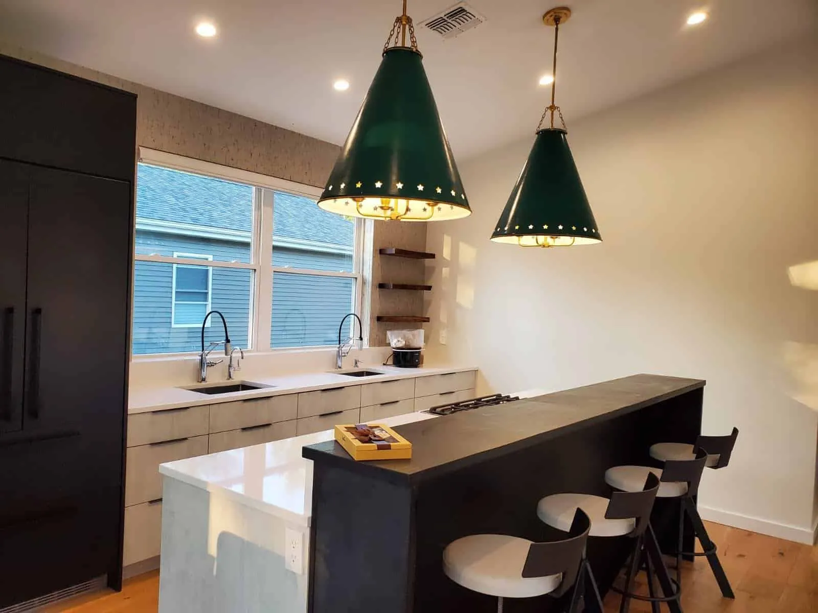 (Photo provided by Kurrent showroom Brooklyn, NY)
People project their desires onto practically everything, and color is no exception. But classic remains classic. Wood (or paint imitating dark wood tones) was used together with gold decorative elements in pharaohs' palaces, ancient Roman temples and 1920s international company boardrooms. Why? Because they complement each other and look good. Simple slate gray walls with bronze accessories can make a bathroom elegant – and elegance is almost always associated with simplicity. These combinations are intuitive and often based on very ancient traditions.
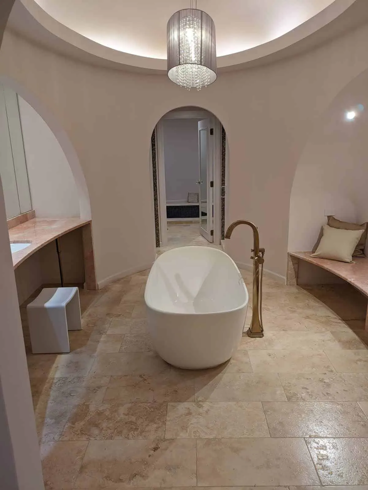 (Photo provided by Kurrent showroom – Brooklyn NY)
Interior designers should use colors moderately and with purpose. Color should highlight and accentuate. Colors have 'flair', and someone with a flair for design can add a rug or vase, or another bright element to the bathroom, and the room can come alive in a unique way. But more often than not, the best color for one of these high-quality ceramic baths is white. You don't need a psychologist to understand why: if a white bathtub is clean and filled with clear, pure water, it's inviting.
This doesn't mean you can't use black marble for a bathtub or any other random color. However, people are generally accustomed to expecting certain colors in specific places, and although they're not against innovations, these basic principles are unlikely to change anytime soon.
Need a renovation specialist?
Find verified professionals for any repair or construction job. Post your request and get offers from local experts.
You may also like
More articles:
 Choose the Perfect Bark Chair for Your Cozy Home
 Choose the Right Alcohol Storage for Your Basement
 Choose the Most Beautiful Colors for Your House Facade
 Choosing the Best Colors for Bedroom
 Choose the Most Amazing Gray Sofa in the Corner
 Choosing the Perfect Sink for a Small Bathroom
 Choosing the Best Personal Wallpapers for Your Home!
 Choosing the Right Stone Supplier for Your Next Project