How to Choose Wallpapers for the Living Room
Wallpapers for the living room: combined wall coverings (photo)
Options for wallpapering in the living room:Vertical alternation of panels. This method is universal and does not impose any restrictions: you can alternate wallpapers with similar shades or contrasting panels. In the first case, you will get an interesting background, and in the second case, you can make a key interior accent on the walls of the living room.
Horizontal alternation of panels. It's easy to achieve a retro style by using stripes with different patterns: the top 2/3 of the wall are covered with wallpapers in a small flower pattern, and the bottom third is covered with wallpapers in vertical stripes. The wallpaper seam can be hidden with a border.
Arbitrary alternation. Wallpaper strips can be layered on top of each other in any order and with any edge shape.
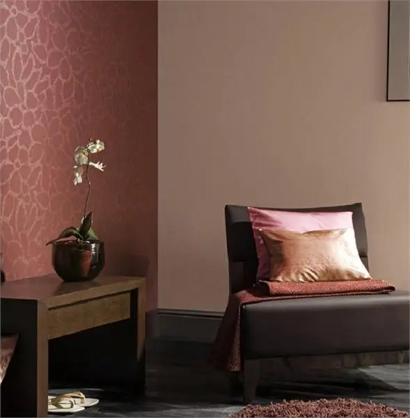
Photo 1 — Model SOP504, Khroma factory
Combined wallpapers for the living room should be placed thoughtfully: such variety of coverings will look better on one wall rather than on all the walls in the room.
Contrast accent is appropriate for walls where a TV or fireplace will be placed – the key point of the room.
However, keep in mind that a decorated wall should fit into the interior design and not look like an iceberg without connection to furniture or textiles. To avoid interior imbalance and balance the appearance of the room, furniture that harmonizes in color with the chosen bright wall accent should be placed on the opposite wall.
Combining Wallpapers: What to Avoid
Mixing expensive and cheap wallpapers. Not only because the difference between them will be visible to the naked eye, but also because these coverings have different manufacturers, service life, light sensitivity, and more. If one panel is damaged, you will have to re-cover the entire room with other wallpapers.
You cannot combine wallpapers of different thicknesses or wallpapers with different bases (if you choose one roll on felt, the rest should be the same). Otherwise, seams will be visible due to differences in panel thickness. Also, there is no guarantee that both types of coverings will last the same amount of time.
The chosen method of combining panels should harmonize with the style of the room or correspond to it.
Wallpaper Design for the Living Room: Tips on Combining (Photo)
Wallpapers with patterns and solid-color panels can be combined based on color schemes. What about combining a pattern with another pattern?
Geometric patterns on wallpapers pair well with abstraction.
Floral motifs look good with naturalistic elements, such as wood patterns.
Vibrant wall hangings should be balanced with solid-color wallpapers or those with a small pattern.
You can combine saturated colors, but only if you want to achieve a kitsch effect. In other cases, bright colors (red, orange, blue, yellow) should be softened with neutral tones.
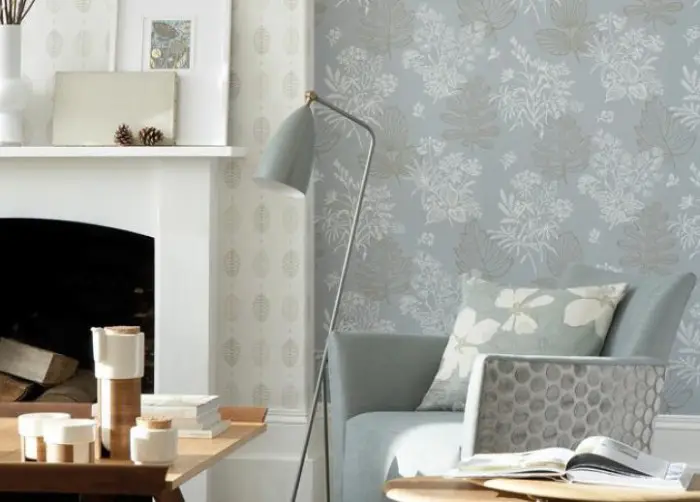
Photo 2 — Model 50s Line Papers Norcombe Welkin, Little Greene factory
Living Room Interior: Provence Style Wallpapers (Photo)
Trendy styles such as Art Deco or Modernism for the mass consumer are still too radical and sometimes even the most modern designer creations fall short of simple elegance. Especially in a "Khrushchev" apartment with ceilings below 2.5 meters, what modernism can there be?
Provence is southern France, surrounded by lavender fields, sunny skies, and warm summers. You can recreate such an atmosphere at home. Many choose the Provence style as an alternative to the "cottage" style – a countryside interior in French manner appears more refined.
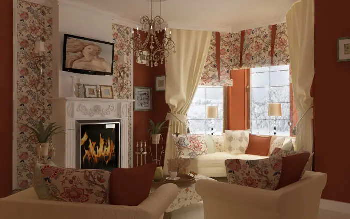
Photo 3 — Provence style in the living room interior
How to properly select wallpapers in this style and not make a mistake?
The main theme of Provence is coziness and simplicity in everything, as well as a touch of rural innocence: it's better to use light matte or semi-matte wallpapers, muted greens (soft olive), soft gray colors, combining them with small pink flowers or other floral motifs.
IMPORTANT! The gray color should not be saturated – rather, it should be close to "dirty" beige. Only in such a color palette can you achieve the feeling of warmth from the wall covering.
Black-and-white, bright red, green, or saturated orange wallpapers should not be used.
The color of the furniture should contrast with the non-bright wallpapers – purple, lavender, soft lilac upholstery; in other cases, furniture is also chosen in beige, milk tones, or soft white.
Provence also implies that the wallpapers for the living room walls should have a characteristic print in a fine mesh pattern with a floral motif. In the room's decor, wooden, artificially aged furniture and textiles with a mesh pattern should definitely appear.
Provence loves an abundance of textiles: various cushions, beautiful tablecloths, napkins, throws for chairs or sofas, curtains, woven or knitted mats.
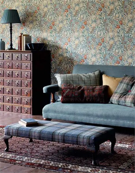
Photo 4 — Model Golden Lily 210401, Morris & Co factory, design by Dearle John Henry
What Wallpapers to Choose for the Living Room?
If the color of the wallpapers and their selection are entirely up to the consumer, it is still advisable to listen to manufacturers' recommendations regarding wallpaper material.
As is known, wallpapers are divided into paper (simplex/duplex), felt, vinyl (polyvinyl chloride on a felt base), textile, glass wallpapers, cork, metallic, and paintable wallpapers (foam vinyl).
The cheapest and most short-lived are paper wallpapers. However, they breathe well, which, by the way, is something that metallic, glass wallpapers, and some types of vinyl cannot boast of. It's easy to find appropriate coverings by design in catalogs from domestic (e.g., the "Slavianskie Oboi" factory, TM "ART", the "Edem" factory, etc.) and foreign (Rasch, As Creation, R+S) manufacturers.
Before choosing paper wallpapers for the living room, pay attention to felt wallpapers. Their resistance to light rays and time is much higher. Although they cost an order of magnitude more, this is a full investment in yourself that fully justifies itself.
The third option is vinyl wallpapers on a felt base. These wallpapers better withstand wet surface cleaning, are easier to paste, and last longer. They cost slightly less than felt ones and, if the vinyl was applied to the surface of the wallpaper not as a solid layer but with micro-pores, such a covering also provides air exchange between the wall and the room.
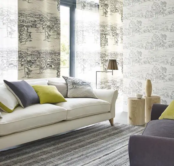
Photo 5 — Model Sussex Downs, Sanderson factory, design by Frean Jenny
Let's summarize.
How to Choose Wallpapers for the Living Room?
Focus on the manufacturer: Ukrainian and Russian quality wallpapers are products from factories such as "Slavianskie Oboi", "ART", "Edem", and "Lanita"; trusted foreign manufacturers include Rasch, As Creation, R+S (Germany), Chesapeake (USA), Homeloboi, Belooboi (Belarus), Sirpi (Italy).
Pay attention to the label: ideally, you should have a lightfast and moisture-resistant coating that can be removed either layer by layer or entirely by peeling.

Photo 6 — Icons on the wallpapers
Focus on color and style: what color you paste will determine the mood in which you spend time in the living room (a bright one may be overly irritating, and a dark one sometimes creates a "cold" feeling).
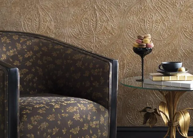
Photo 7 — Model Paradiso Campaldino 4032-01, Nina Campbell factory
Wallpapering in the Living Room: Main Rules
Wallpapers for the Living Room: Prices
- Kiev – from 67 UAH per roll;
- Moscow – from 1,400 RUB per roll.