Color Trends in Interior Design 2015
Color is the foundation of any design. In the upcoming year, natural and earthy tones taken from nature are in vogue. Overly intense shades are muted, yet designers do not completely abandon bright colors. Moreover, professionals do not prohibit mixing saturated color schemes and even encourage various combinations.
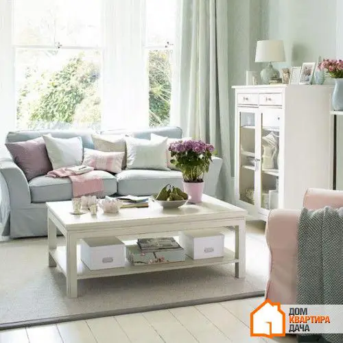
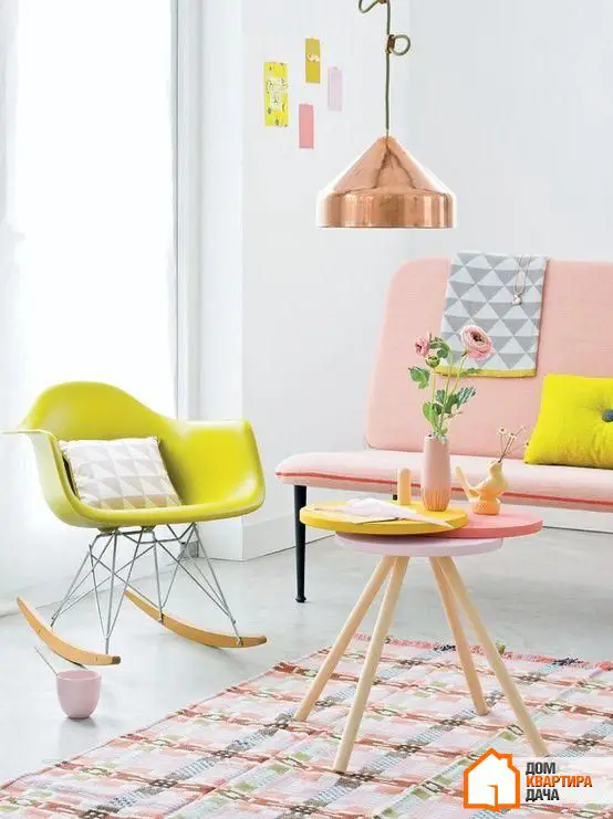
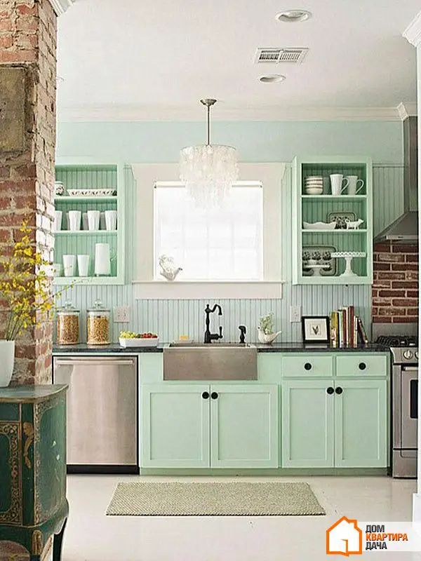
Soft Pastel
Designers recommend choosing colors for interior design based on the look around principle: take a look around and pick what you see. Cool brown tones combined with granite gray and green elements (such as leaf or olive color) are one of the popular combinations in the new season.
For example, designer Kostas Prevazanos suggests using a soft "summer" palette in interior design with neon accents: orange and purple tones of hot sunshine, green of palms, and soft pink of flamingo. All tones should be muted, and it is better to use them against white.
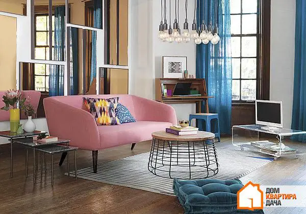
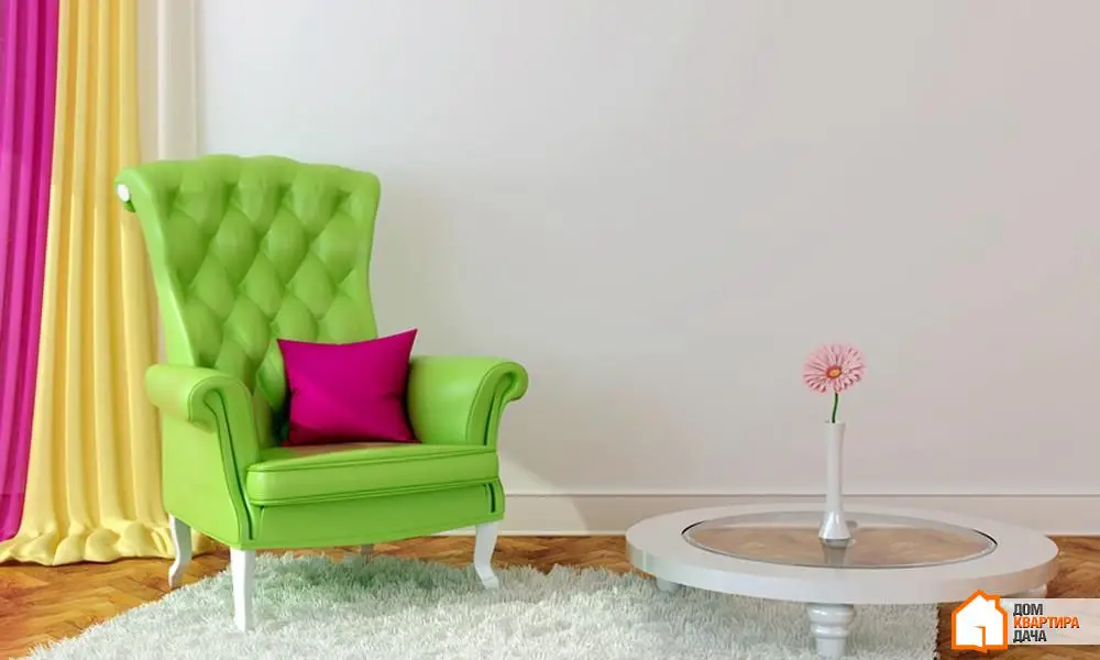
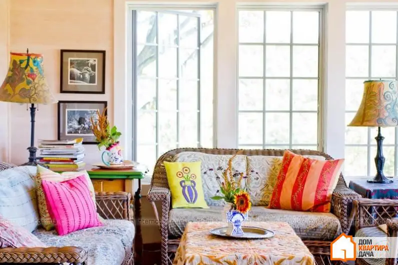
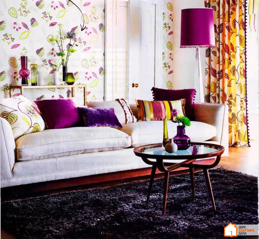
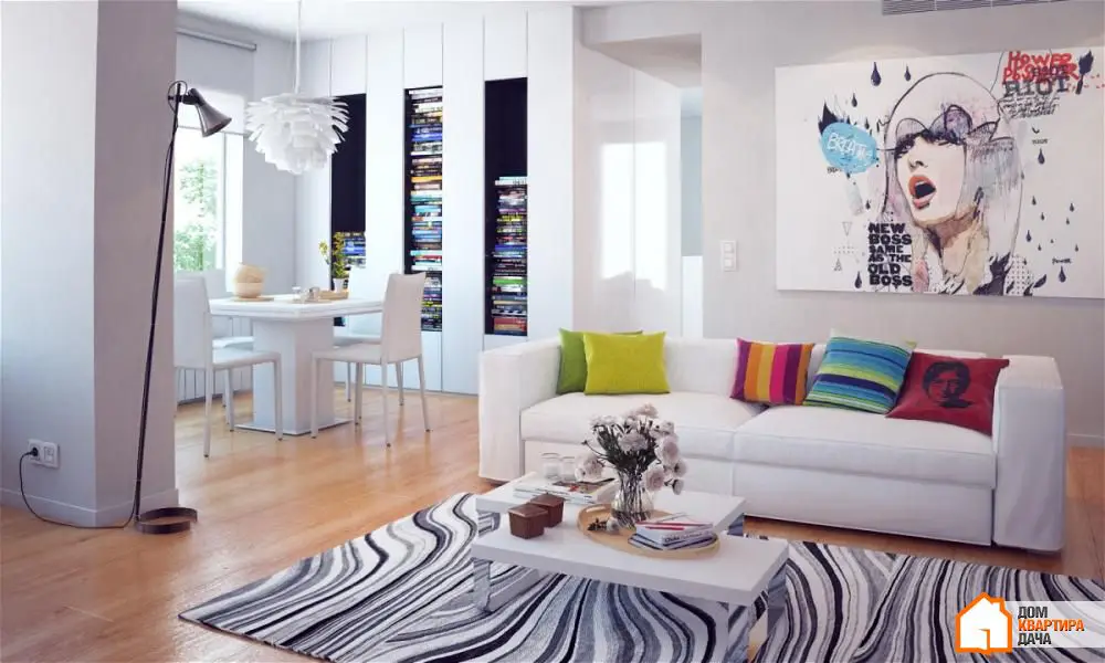
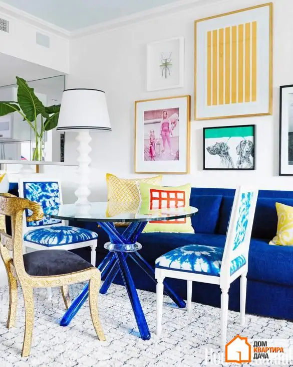
Bright Mix
Popular is the combination of diametrically opposite colors, such as mustard yellow and lilac. Designer Grant K. Gibson shares a more daring experience: he combines bright colors like pink, violet, and bright green with aquamarine.
Interior boutique Tilton Fenwick presented their version of the 2015 trend – a combination of turquoise and green in the form of an intricate pattern in an Eastern style.
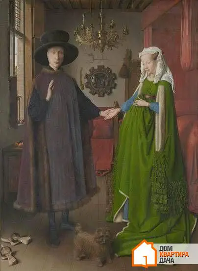
Renaissance Era
Popular colors of the future come from a very distant past. For example, Alessandra Branca lists shades used in Renaissance paintings: green, plum, sky blue, beige, and white. The designer suggests mixing these colors, as well as using patterns and textures from that era.
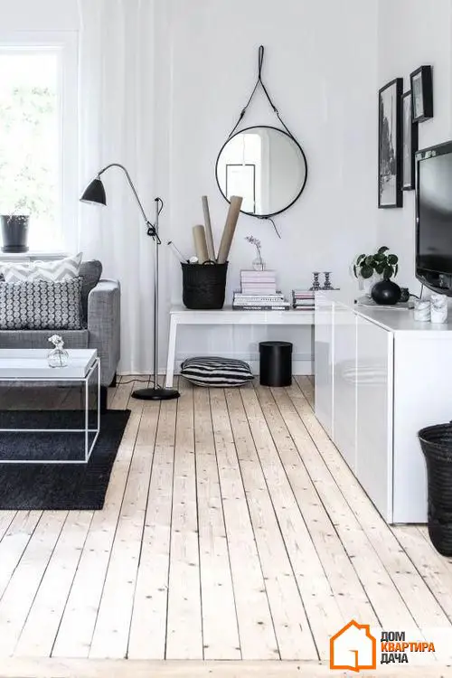
White
Light
White is an excellent background for creating any palette in interior design: it can make any color slightly brighter than the white itself, not to mention saturated tones. Designers reveal a little secret – to prevent white from appearing too harsh, add a drop of black and yellow dye to the paint. In this way, you slightly mute the brightness of white, but the color won't appear muddy.
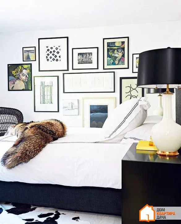
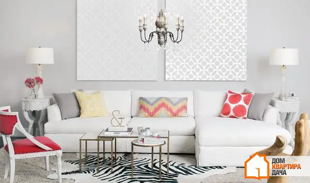
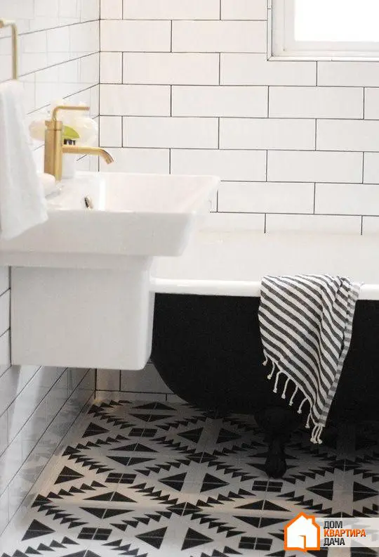
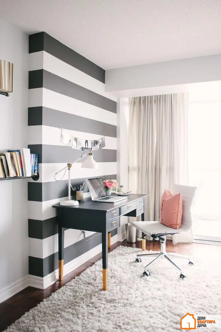
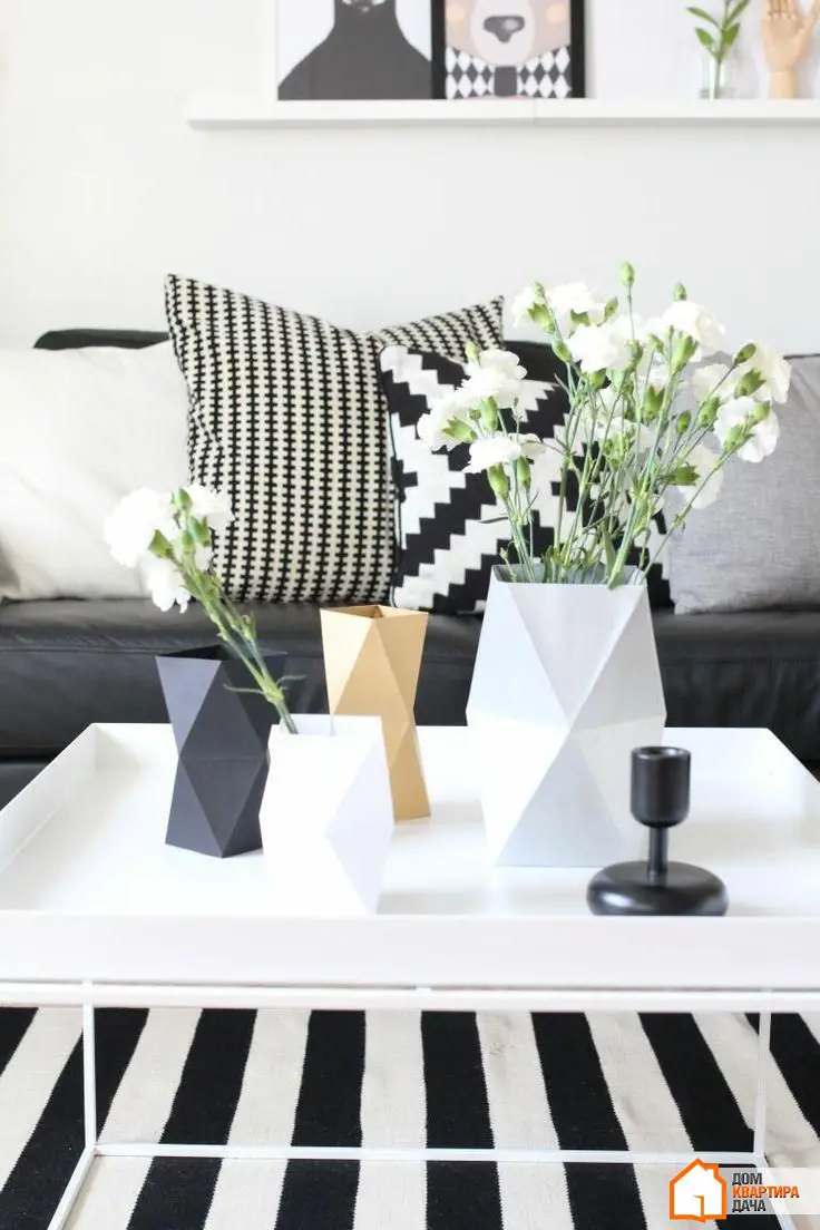
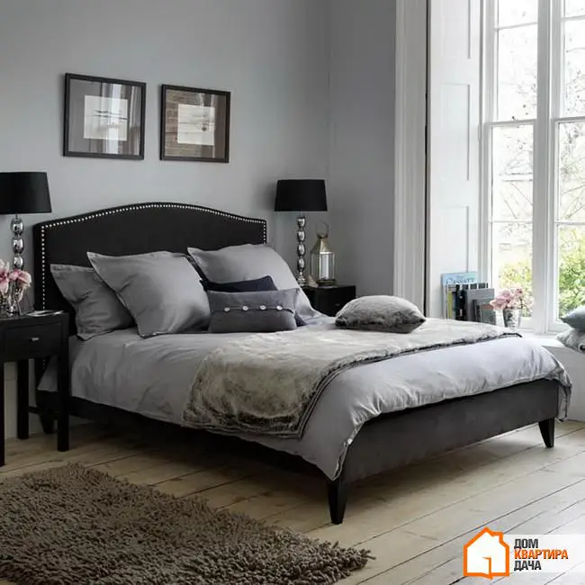
Black and White
World
Timeless classic. Yin-Yang. Colors are opposites. However, designers strongly recommend not forgetting balance. In interior design, such color combinations as a chessboard or intricate patterns will be appropriate – the main principle is that black is on white, and white is on black, so colors neutralize each other. If, for example, there is more black than white, it may cause discomfort to the human eye.
The combination of black and white allows for both strict geometric lines and abstract patterns. This is one example where fashion from the runway comes straight into the home – such a palette is also popular in the Spring-Summer 2015 collection by Carolina Herrera.
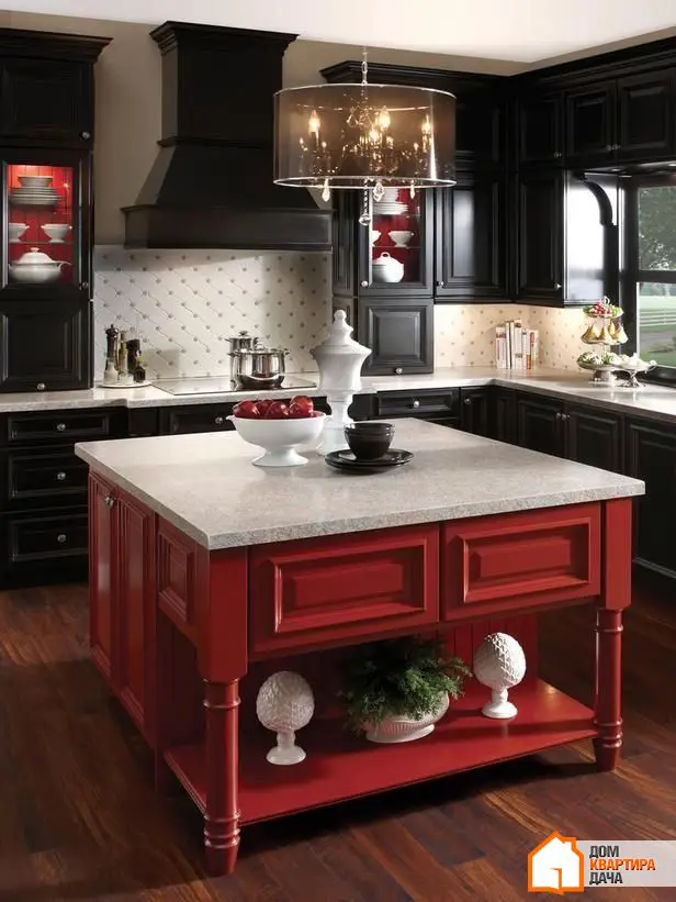
Gray Cardinal
The neutral gray color does not give up its position for the first time in a season. In 2015, a mix of different shades of gray will be in vogue. For example, "star" designer Jeff Andrews suggests combining soft gray walls with coal-toned decor and gray-white ceiling. He recommends adding variety with bright accents, such as citrus tones or dark red.
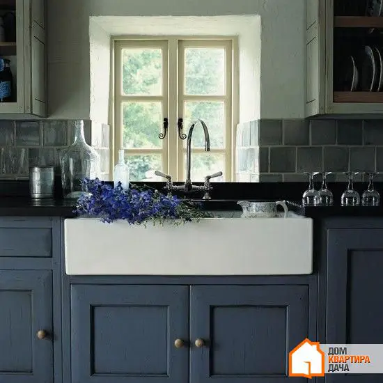
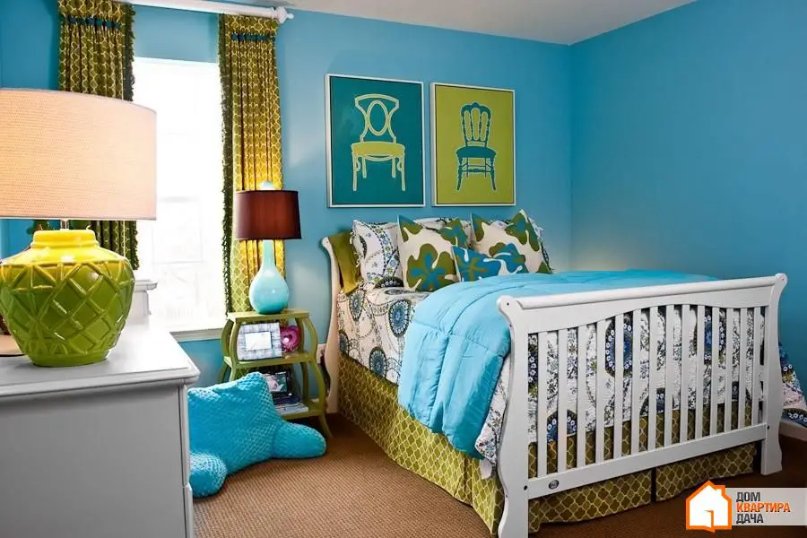
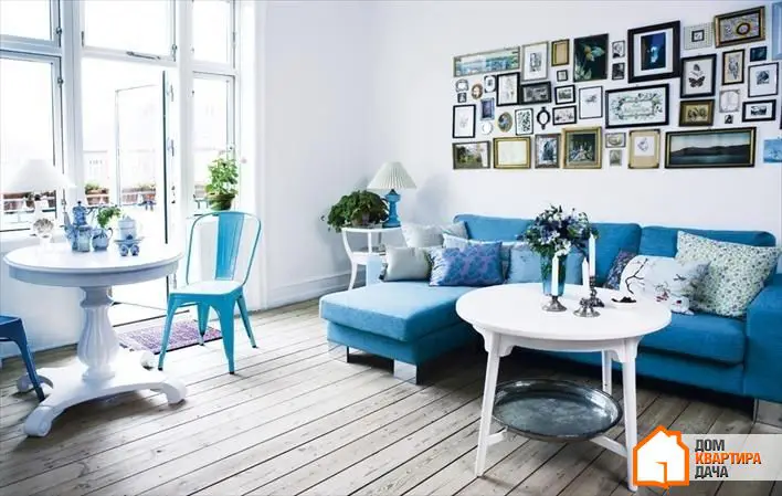
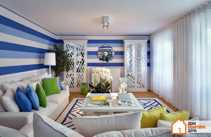
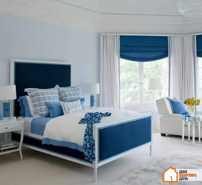
Blue, Blue Sea
Deep and vibrant, blue pairs well with other colors and allows for multiple shades of blue within a single interior. For example, designer Suzanne Salk suggests complementing it with decor slightly lighter or darker in tone. The duo of blue and white can be called a classic that will remain at the peak of popularity in the next season.
Blue is indispensable for creating Mediterranean-style interiors. Vibrant blue, designer Sarah Story sees in a combination with gray and pink. Remember that blue is a strong standalone color, and thus other colors should only highlight it, not compete with it.
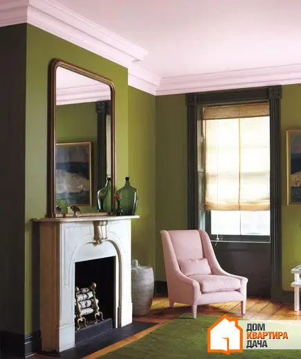
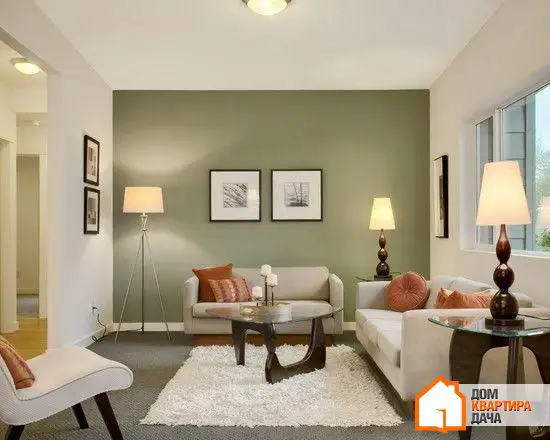
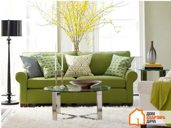
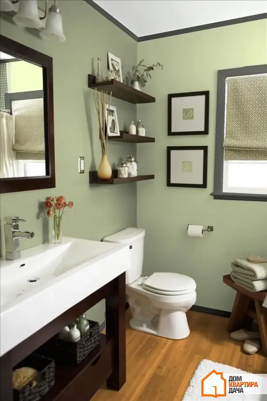
Olive Paradise
This color also appears in interiors for the first time, and its popularity is not accidental – it is a warm and cozy shade of green. Despite the trend toward military shades being dictated by tense global situations, olive in interior design looks incredibly calming and harmonious.
Designer Capella Kinchloe states that anyone can handle olive. Since this color is natural and earthy, it's best to pair it with neutral pastel tones: mint, eggplant, and rust color.
Need a renovation specialist?
Find verified professionals for any repair or construction job. Post your request and get offers from local experts.
You may also like
More articles:
 Indoor Plants in Modern Interior: 5 Ideas, 20 Examples
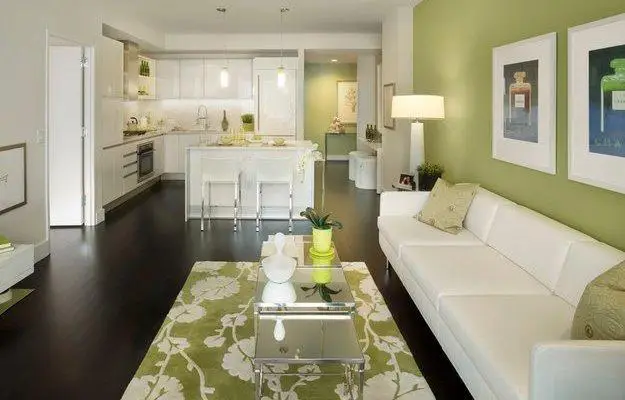 What to Pair Dark Floors With? 5 Tips, 30 Examples
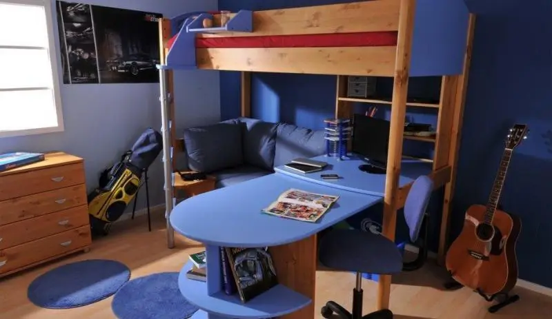 Workspace for Boy-Teenager - It's Possible to Sit There!
 How to Choose a Console for the Living Room: 3 Useful Tips
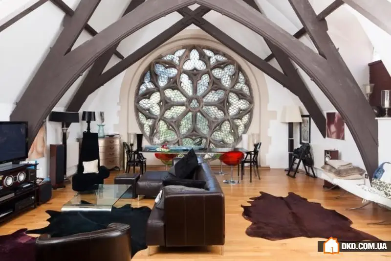 24 Unbelievable Living Room Designs from Around the World
 25 Captivating Poolside Bar Designs That Will Impress Your Guests
 10 Original Designs for Summer Kitchen
 21 Hypnotizing Exterior