Color combinations that never fail in the living room
 Pinterest
Most rooms are decorated with a neutral base to make them (or appear) light and airy. Prevent them from looking too flat by adding other soft or saturated colors. To help you avoid mistakes in selection, we'll tell you about foolproof combinations that will make your living room look like a magazine.
WHITE + BLUE
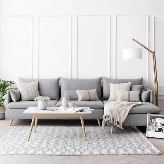
 Pinterest
White baseboards on the ceiling are repeated in the paneling of this room. Between them, the walls were painted a soft gray color. The result? A brighter and warmer room with a note of elegance.
WHITE + EARTH TONES
 Pinterest
One of our favorite color combinations for a living room is white with earth tones. A great way to add light and warmth in equal proportions.
WHITE + BLUE + BEIGE
 Pinterest
Using a soft and monochromatic palette in the living room enhances illumination. For this reason, we love combinations of neutral tones: white, gray, beige... in various intensities. This gives the room a more modern and warm look. When combined with small accents of black, which soften beige and gold, the result is a powerful, very cosmopolitan room.
WHITE + BEIGE + AQUA GREEN
 Pinterest
With the brightness of white, warmth of beige, and freshness of green, this color combination is flawless. With it you can create a relaxing atmosphere, perfect for relaxation in the living room.
BEIGE + BROWN
 Pinterest
From beige to brown, warm tones uniquely add warmth to a living room. They also create a calm and evergreen atmosphere. Therefore, they are one of the combinations that never fail. Interior designers used beige tones in bookshelves and sofas, while warmer shades were used in wallpapers, blinds, and armchairs. Very classic!
Need a renovation specialist?
Find verified professionals for any repair or construction job. Post your request and get offers from local experts.
You may also like
More articles:
 Sofas That Will Become the Main Trendsetters in 2023
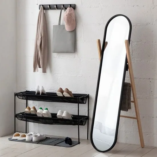 Standing Mirrors You'll Be Thrilled By
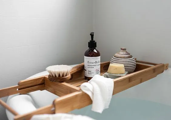 Star Accessory for Bathroom Relaxation - Bathroom Bridge
 Summer Garden Chairs You Should Have at Home
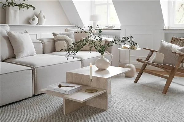 Super elegant salon for inspiration
 Principles of Desired Rented Housing
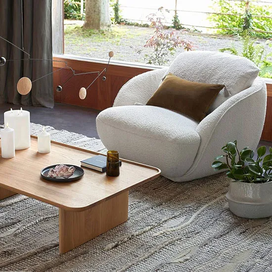 Terrace Chair Returns
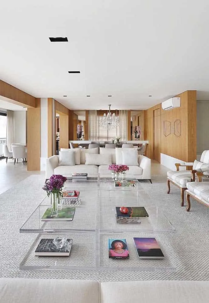 Everything That Should Be in Every Dream Home