Worst 3 Colors for Painting the Living Room
There are rare colors that won't work well for home painting, and colors that simply don't function in rooms like the living room. These 3 colors deserve an award!
RED, TOO INTENSE COLOR
 Pinterest
The color red is always associated with passion and intensity. It's no surprise since it's the most visual hue completely tied to our instincts. So if you want your living room to be a space of calm and peace, forget about red color. It's also a bad choice because it reduces the sense of space and creates feelings of suffocation and pressure. Ideal colors for a living room? Neutral, green and blue tones.
VOILET, BE CAREFUL WITH DARK ONES
 Pinterest
Violet, at intensity, decreases space and like red color, causes feelings of suffocation and overload. This is due to violet containing a portion of red color. Although we know it can be tempting in fall or winter seasons, we recommend choosing lighter shades or, at the very least, painting only one area in this tone provided that the living room is spacious enough.
BRIGHT YELLOW, ENERGETIC BUT VERY STIMULATING
 Pinterest
Painting living room walls bright yellow is like drinking five cups of black coffee at once: you get an overload and stimulation. Despite this tone conveying energy and positivity, such intensity turns energy into anxiety — something you don't want for a relaxation room. Farewell!
Need a renovation specialist?
Find verified professionals for any repair or construction job. Post your request and get offers from local experts.
You may also like
More articles:
 Residential House SHN by Architects Doron Sheinman in Neve Shalom, Israel
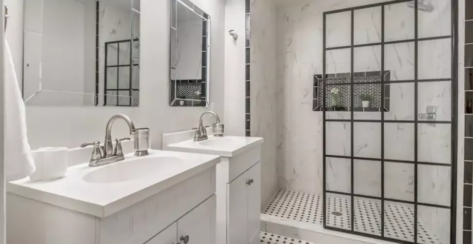 Bathroom Roof — A New Trend for Bathroom Design
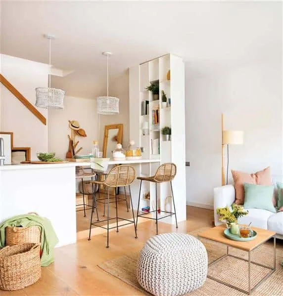 Smallest but Very Stylish Apartment for Living
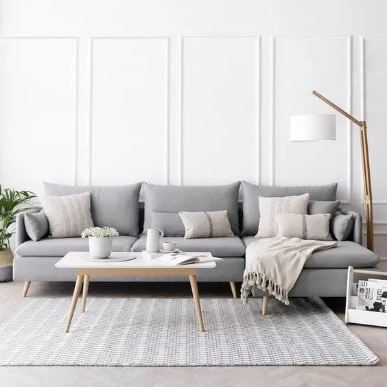 Sofas That Will Become the Main Trendsetters in 2023
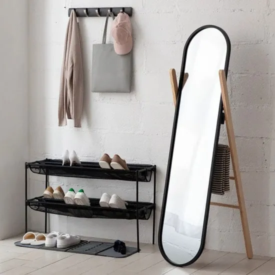 Standing Mirrors You'll Be Thrilled By
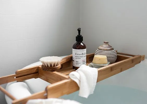 Star Accessory for Bathroom Relaxation - Bathroom Bridge
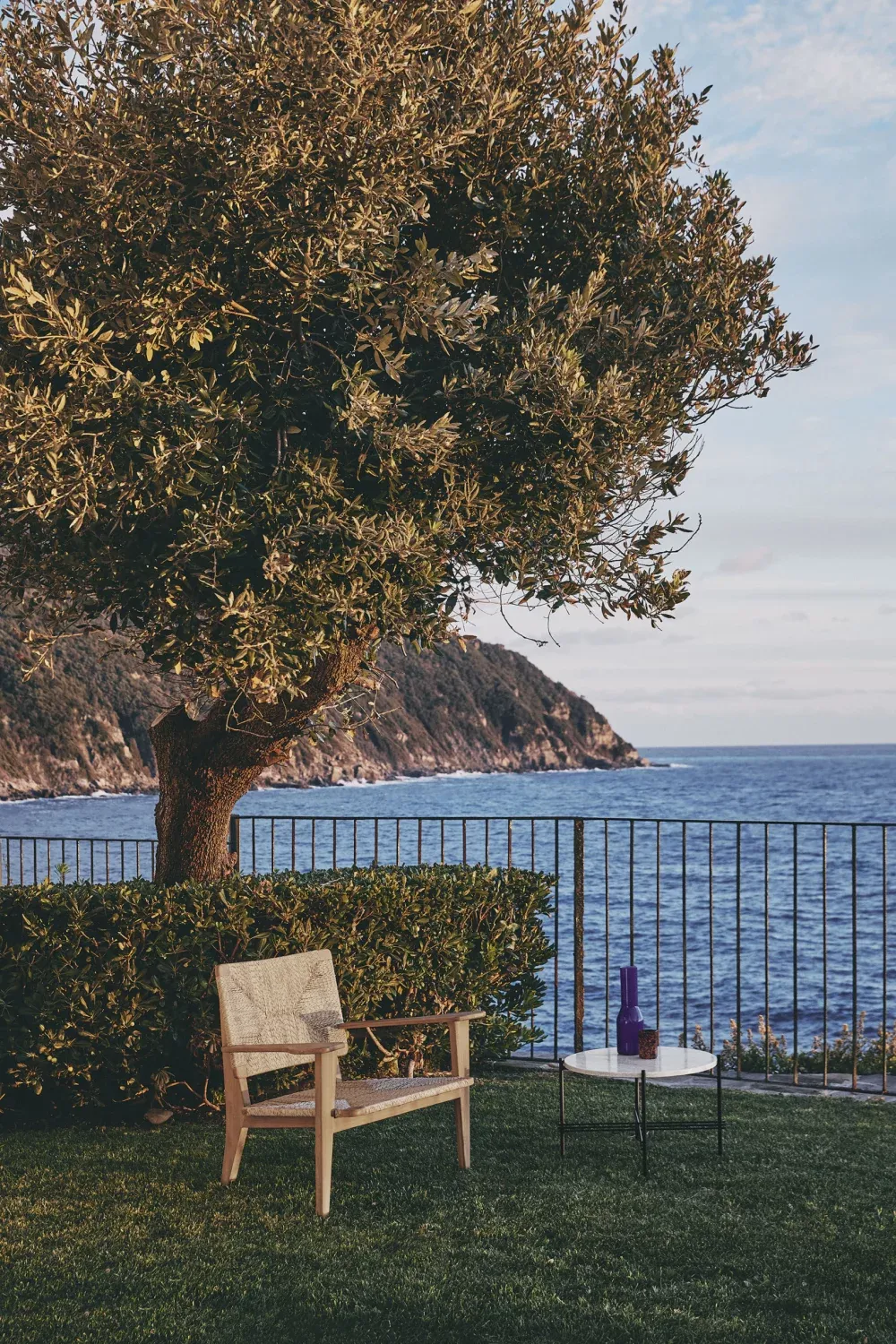 Summer Garden Chairs You Should Have at Home
 Super elegant salon for inspiration